
A Play on Mid-Century Eclecticism
This home was designed with hosting in mind. The brief called for a space that feels open, expressive and comfortable, somewhere that could easily accommodate gatherings while still functioning well for everyday living. The design draws inspiration from mid-century forms and materials, layered with eclectic details and playful colours.
354 Ang Mo Kio
This home was designed with hosting in mind. The brief called for a space that feels open, expressive and comfortable, somewhere that could easily accommodate gatherings while still functioning well for everyday living.
The design draws inspiration from mid-century forms and materials, layered with eclectic details and playful colours. Rather than adhering strictly to a single style, the interior embraces a mix of elements that together create a home that feels personal and lived-in. The result is an apartment that feels airy, relaxed and full of character.
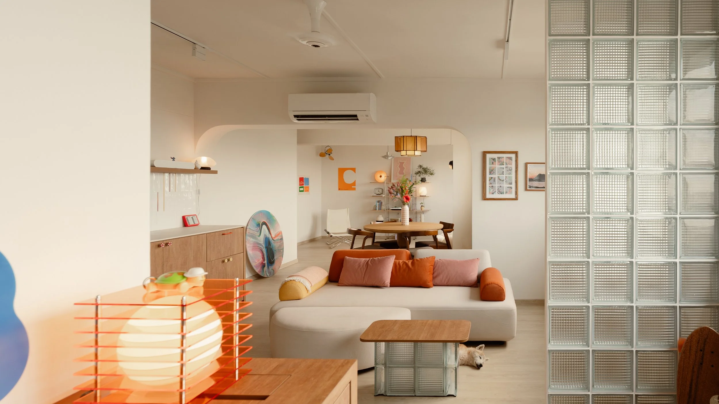
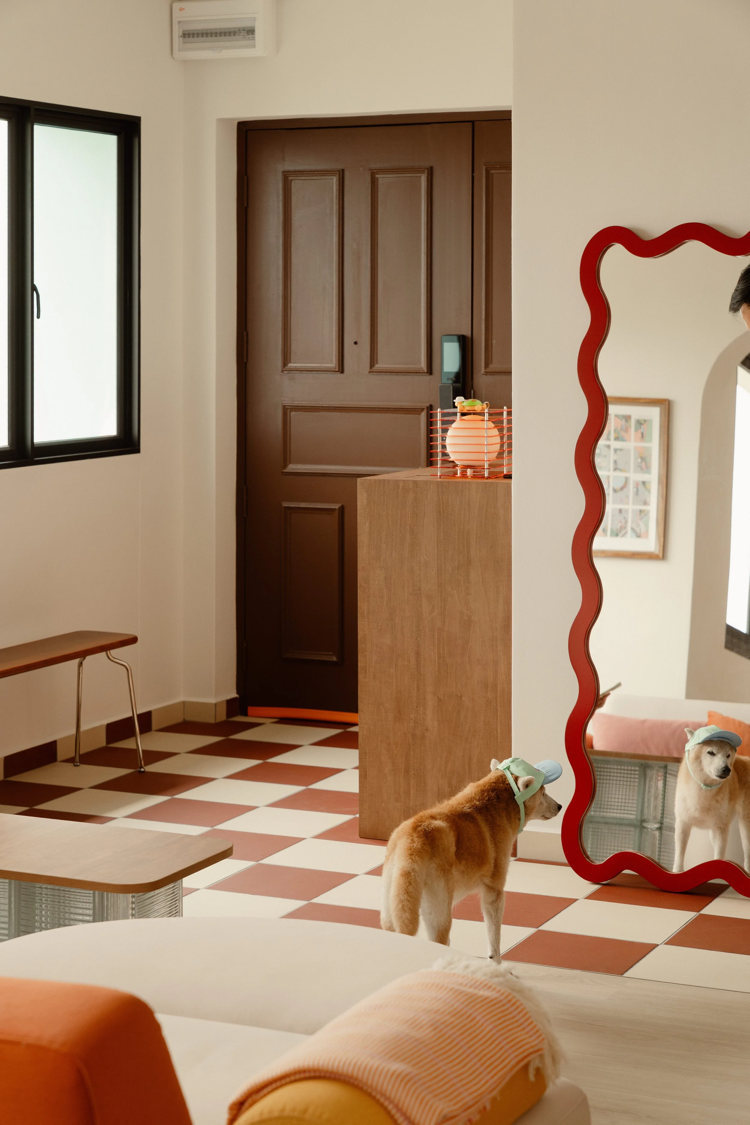
A Light-Filled Entrance with Glass Blocks
At the entrance, a glass block divider introduces both separation and permeability between the entryway and the main living area. Instead of using a solid wall, the glass blocks allow natural light to filter through while still defining the boundary of the space. This keeps the apartment visually open while creating a subtle sense of arrival as one steps into the home.
The textured blocks add a soft diffusion of light throughout the day, bringing a sense of movement and warmth to the entry.
In keeping with the project’s spirit of resourcefulness, leftover glass blocks from the divider were repurposed into a custom coffee table. The piece becomes both functional and sculptural, a small detail that reinforces the design language of the home.
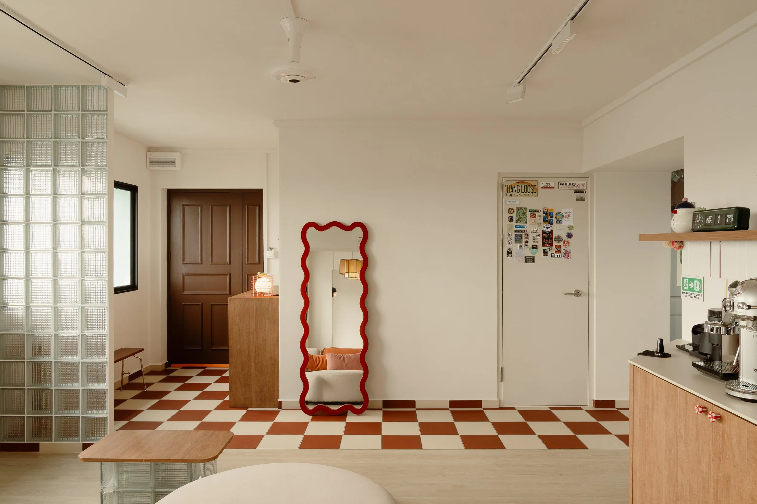
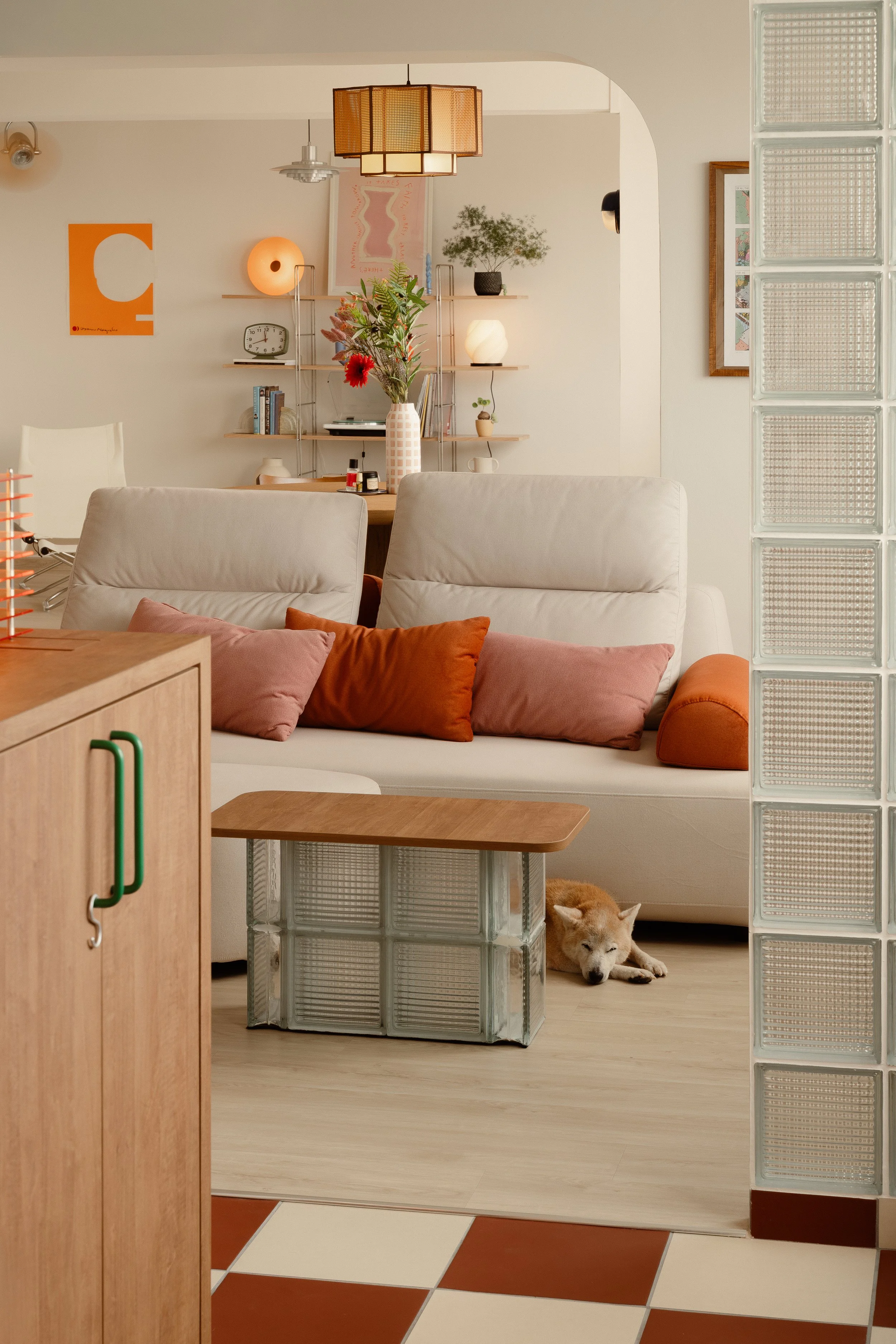
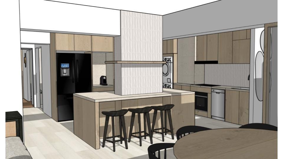
Terracotta Tiles Leading into the Kitchen
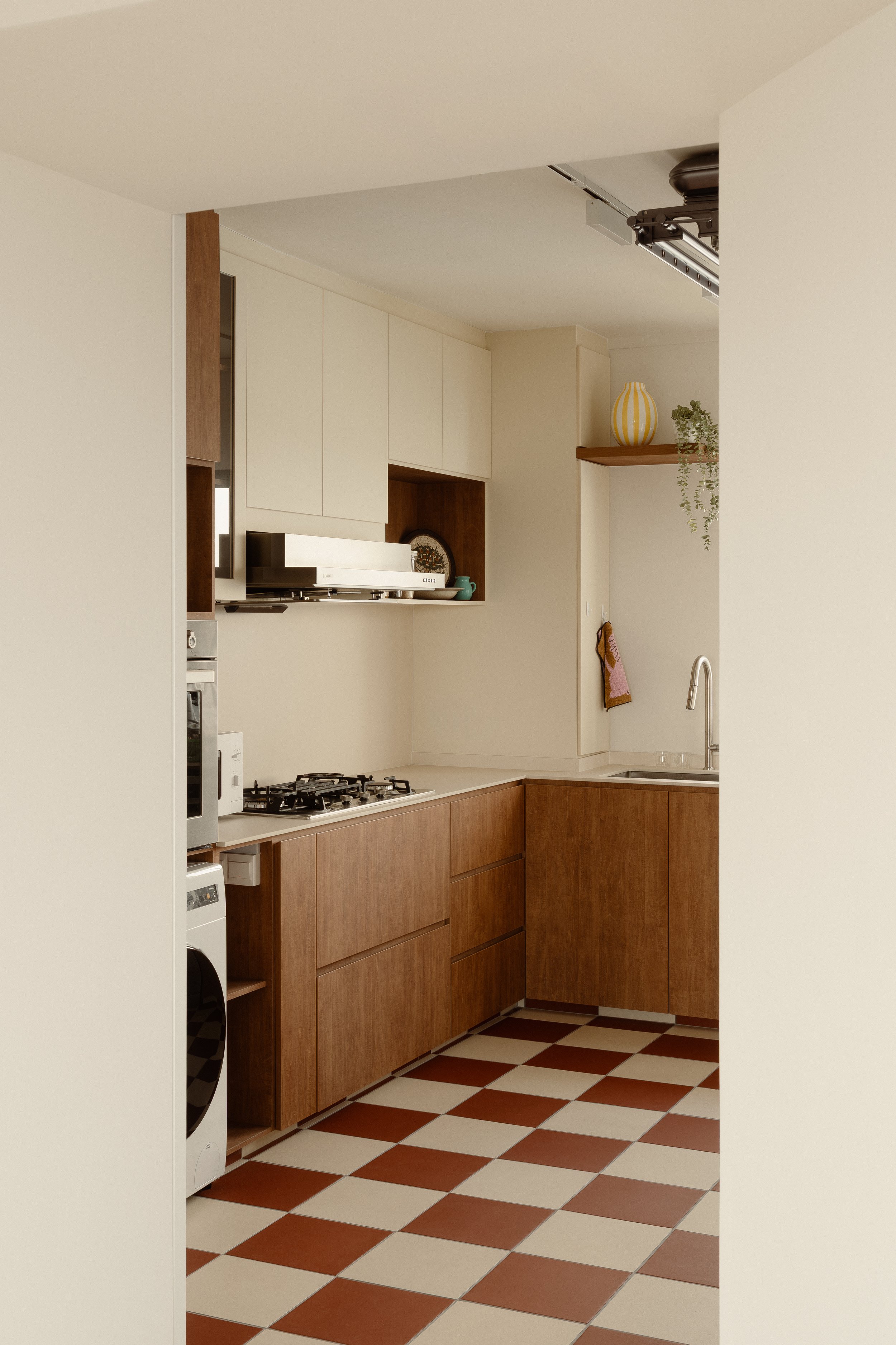
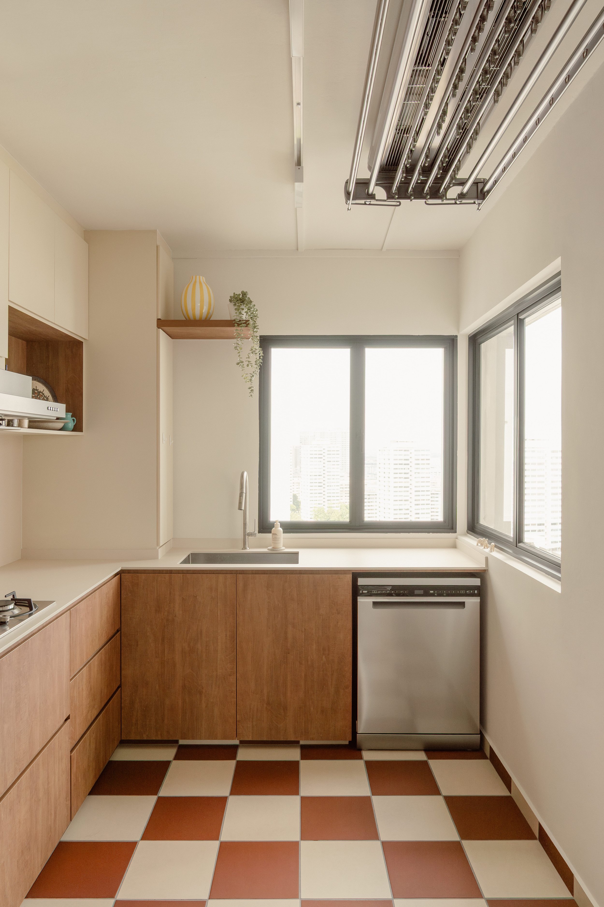
A distinctive transition occurs as the living space leads into the kitchen. Here, checkered terracotta tiles introduce a stronger visual rhythm while grounding the kitchen area with warmth and texture. The pattern adds character without overwhelming the space, referencing the playful geometry often associated with mid-century interiors. The terracotta tones also contrast gently with the lighter tones of the living area, creating a subtle shift in atmosphere between the two spaces.
A Slanted Pantry for the Coffee Ritual
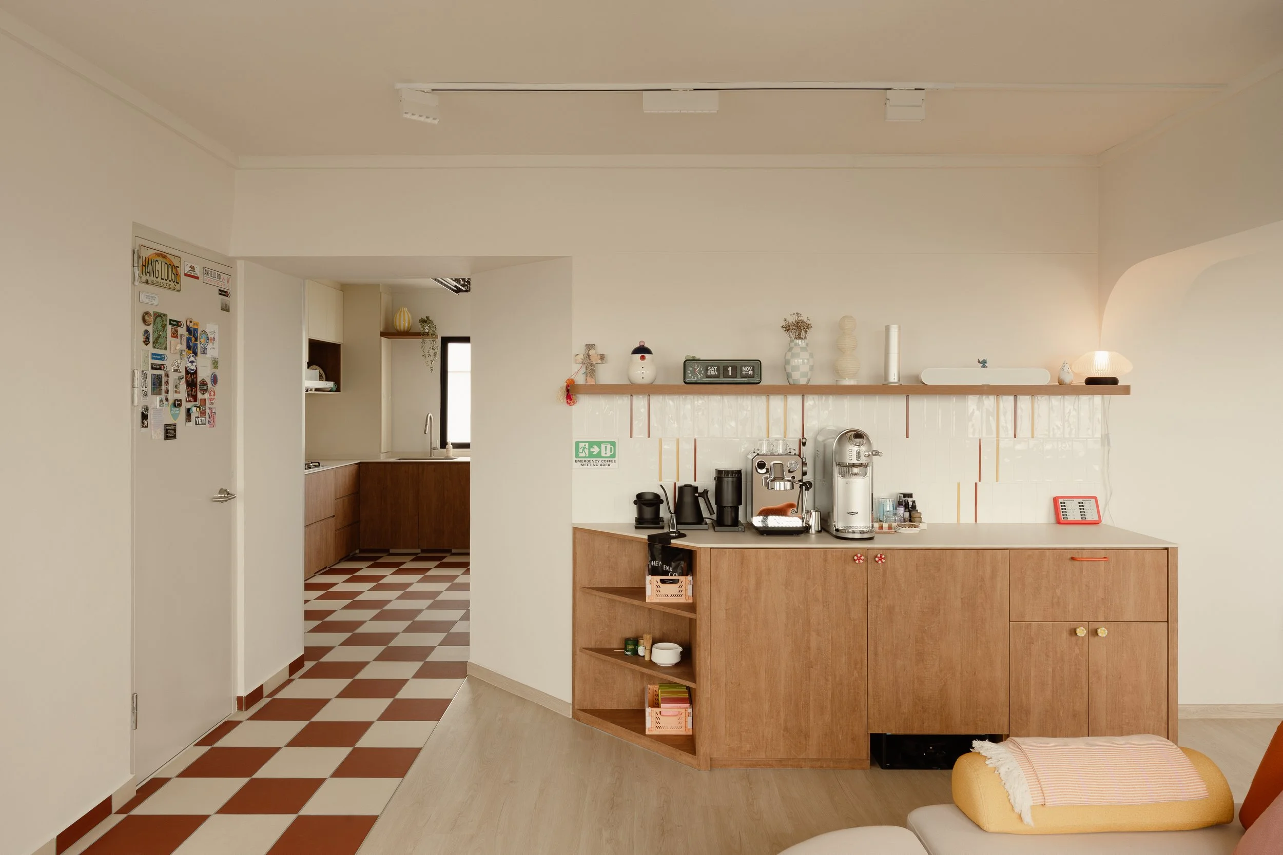
Leading into the communal space, a slanted built-in pantry was designed specifically to accommodate the homeowner’s coffee setup. The angled form not only caters enough space for the kitchen’s entrance, but also adds visual interest while making the storage feel integrated into the living space. It provides dedicated space for coffee equipment and supplies, turning a daily routine into a small, intentional corner within the home.
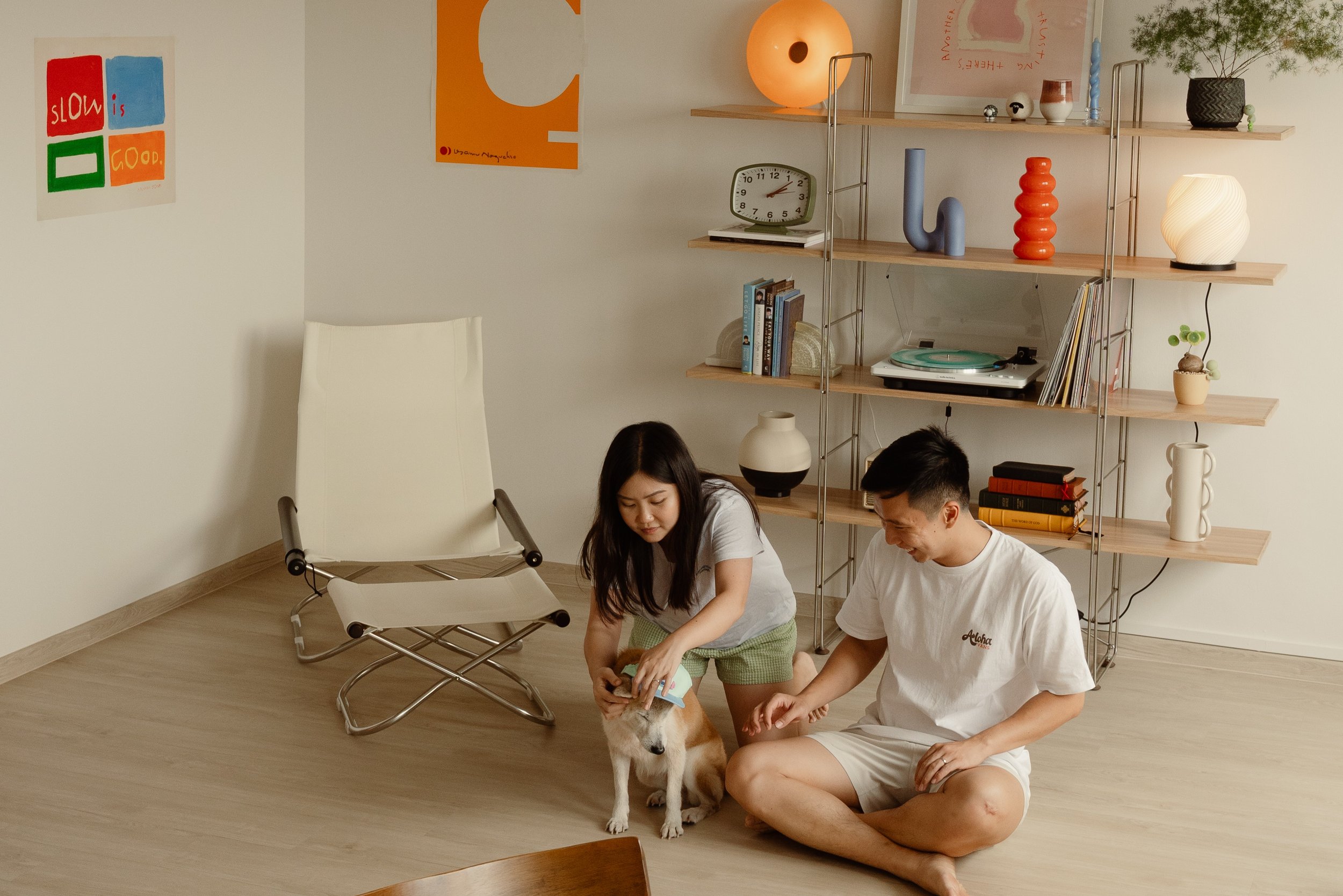
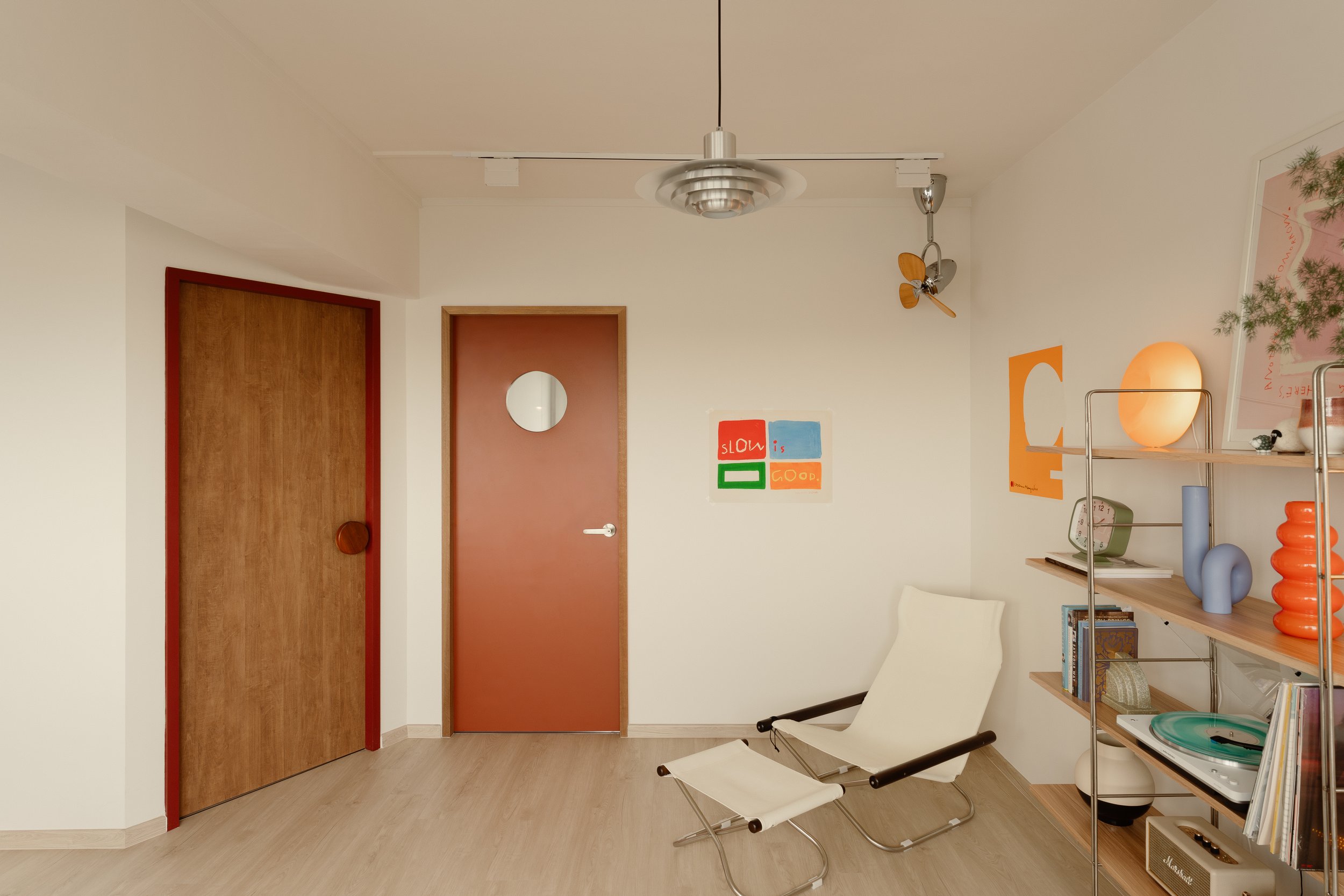
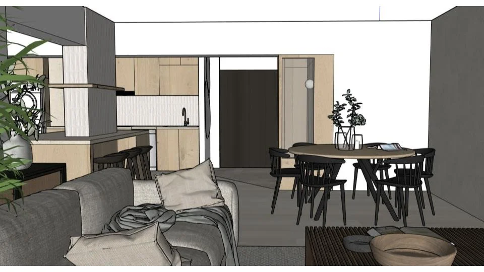
Colour and Furnishings that Bring the Space to Life
Furniture and decor play an important role in completing the home’s eclectic identity. Colourful furnishings are layered throughout the living and dining areas, introducing warmth and individuality without overwhelming the calm architectural base.
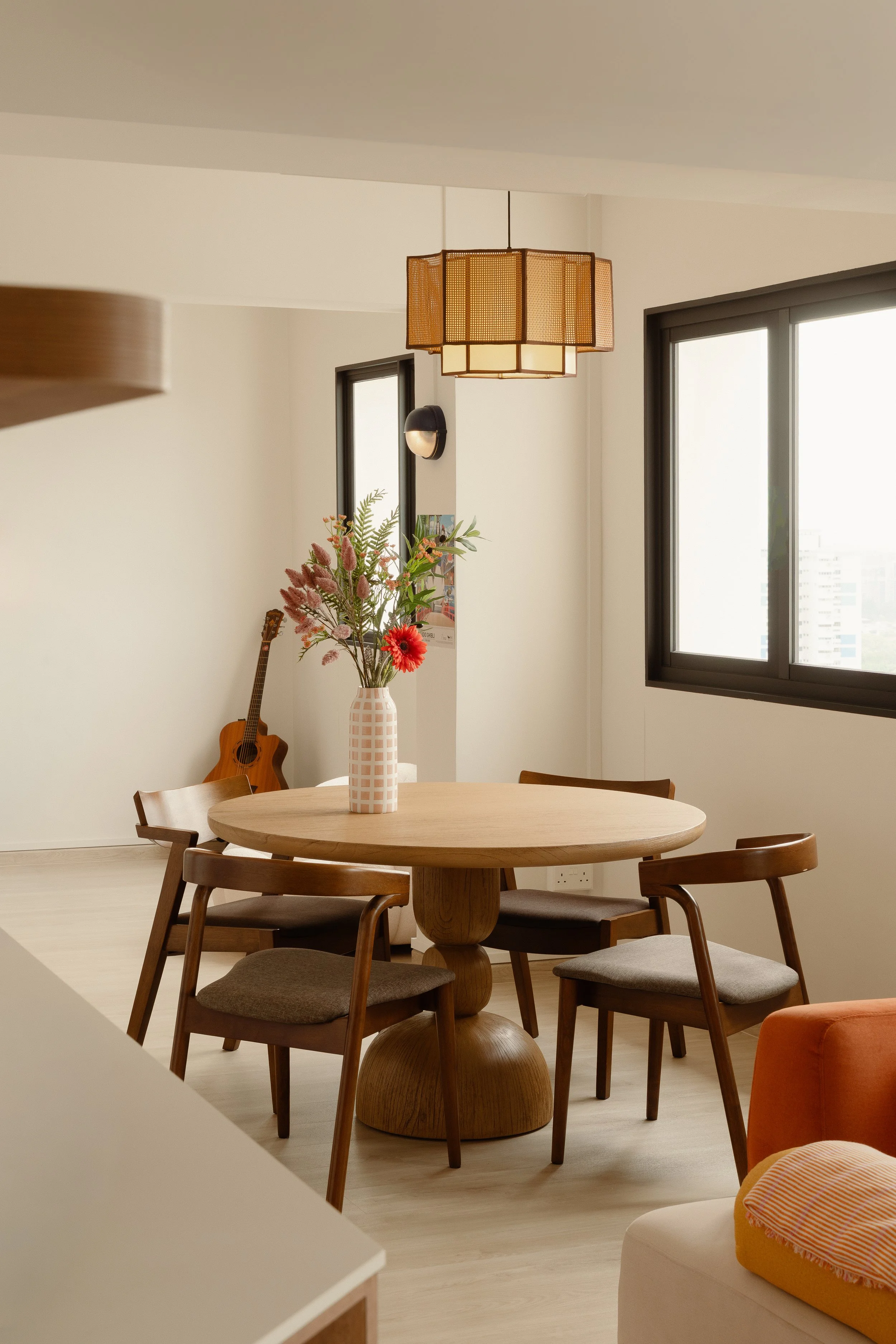
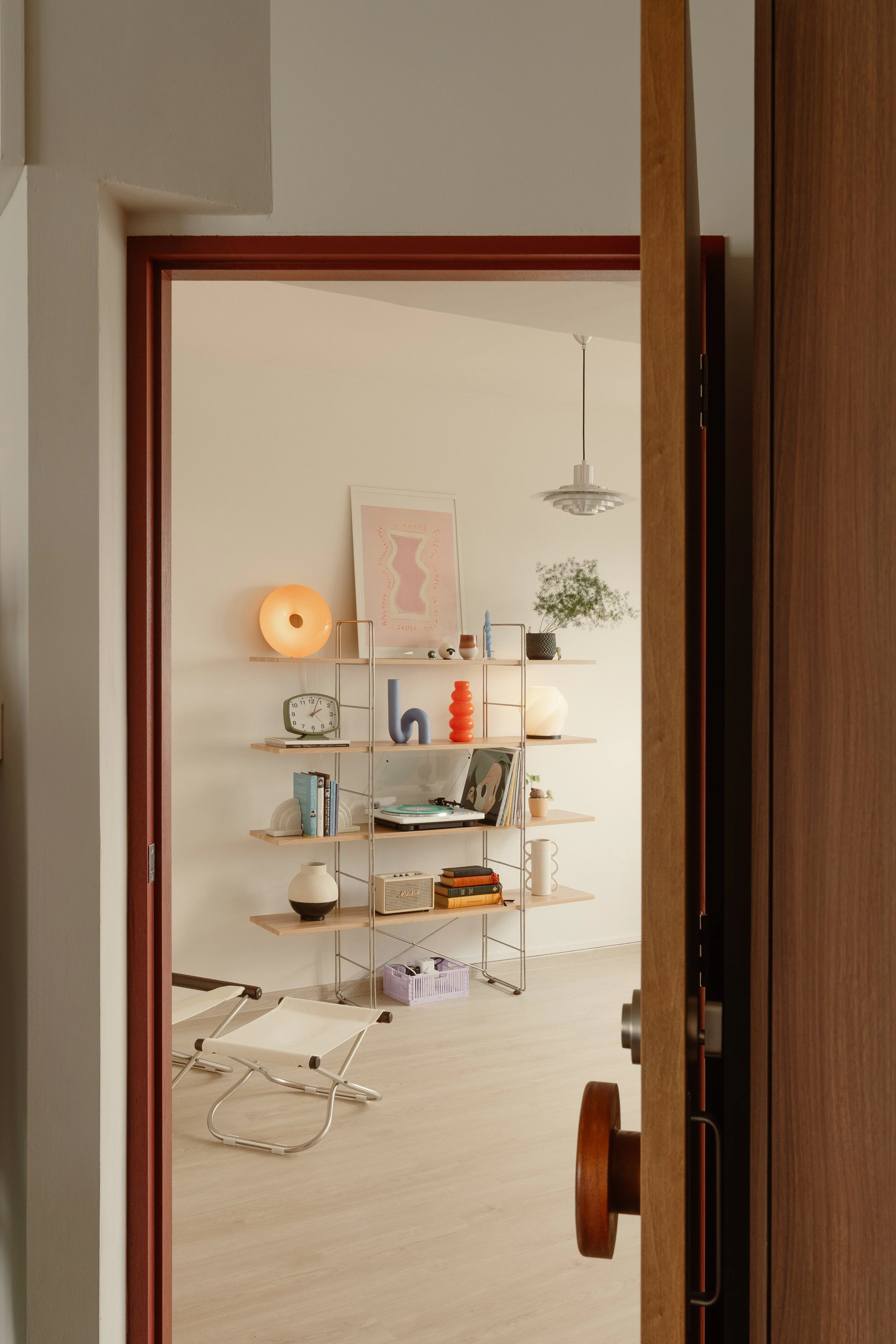
These pieces bring energy into the interior while maintaining a balanced composition.
Designed for Gathering
Above all, the apartment was designed to support hosting and shared moments. The open layout, generous circulation space, and airy atmosphere make it easy for friends and family to gather comfortably.

Whether it’s casual conversations in the living room, coffee in the kitchen, or evenings spent around the dining table, the home provides a setting that encourages connection.
Through thoughtful planning and expressive details, the design balances mid-century influences with eclectic touches, creating a space that feels welcoming, relaxed and uniquely its own.
If you’re inspired to transform your space, connect with our designers here —we’d love to bring your vision to life.
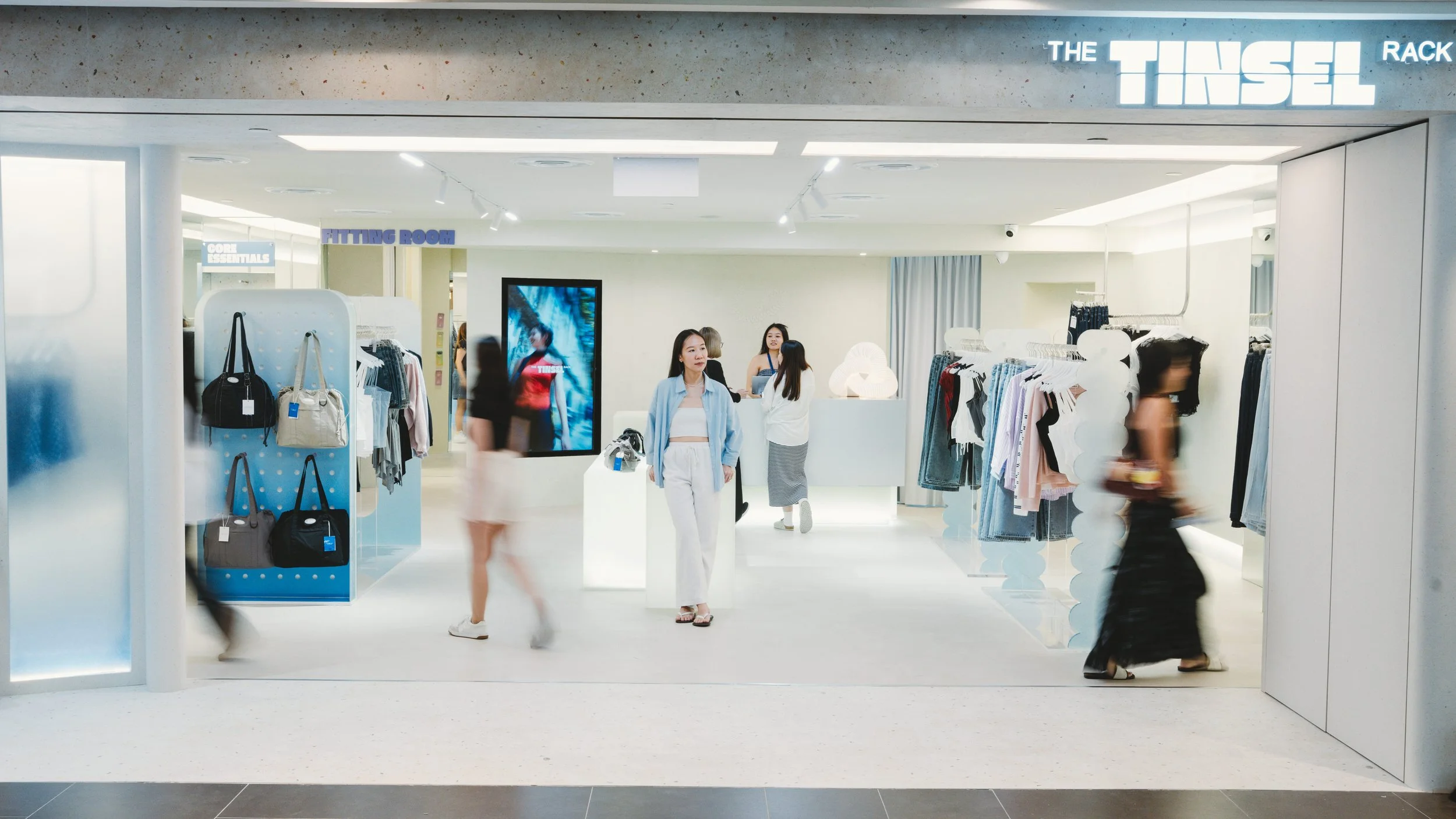
Flagship Rebrand for a Local Fashion Label
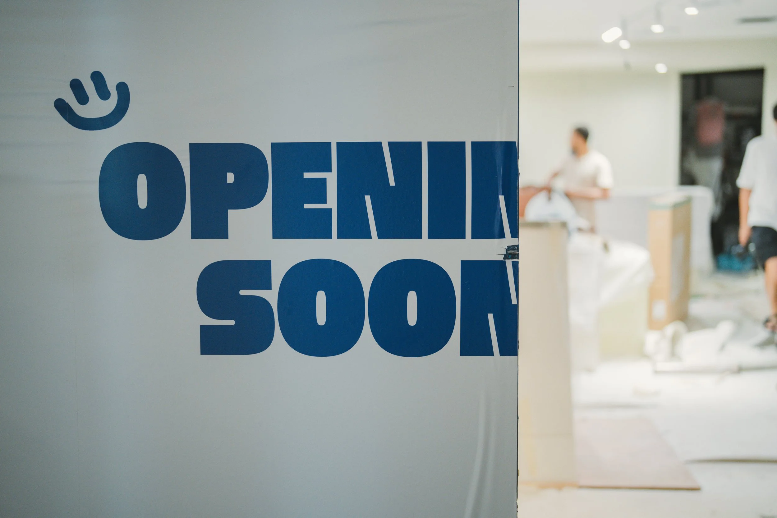
When the founders of Tinsel Rack began planning their flagship store, the goal was not simply to open a larger retail space. The store needed to reflect the brand’s rebrand, a shift towards a look that feels modern, timeless, and more reflective of the brand they have grown into over the years.
The Tinsel Rack, Plaza Singapura
When the founders of The Tinsel Rack began planning their flagship store, the goal was not simply to open a larger retail space. The store needed to reflect the brand’s recent rebrand, a shift towards a look that feels modern, timeless and more reflective of the brand they have grown into over the years.
Design Direction
The design brief was therefore centred on creating a space that feels both fresh and enduring, while remaining familiar to the long-time community that has followed the brand since its early days. Rather than relying on overly decorative retail elements, the design focuses on clarity, lightness and materials that allow the clothing to remain the visual focus.
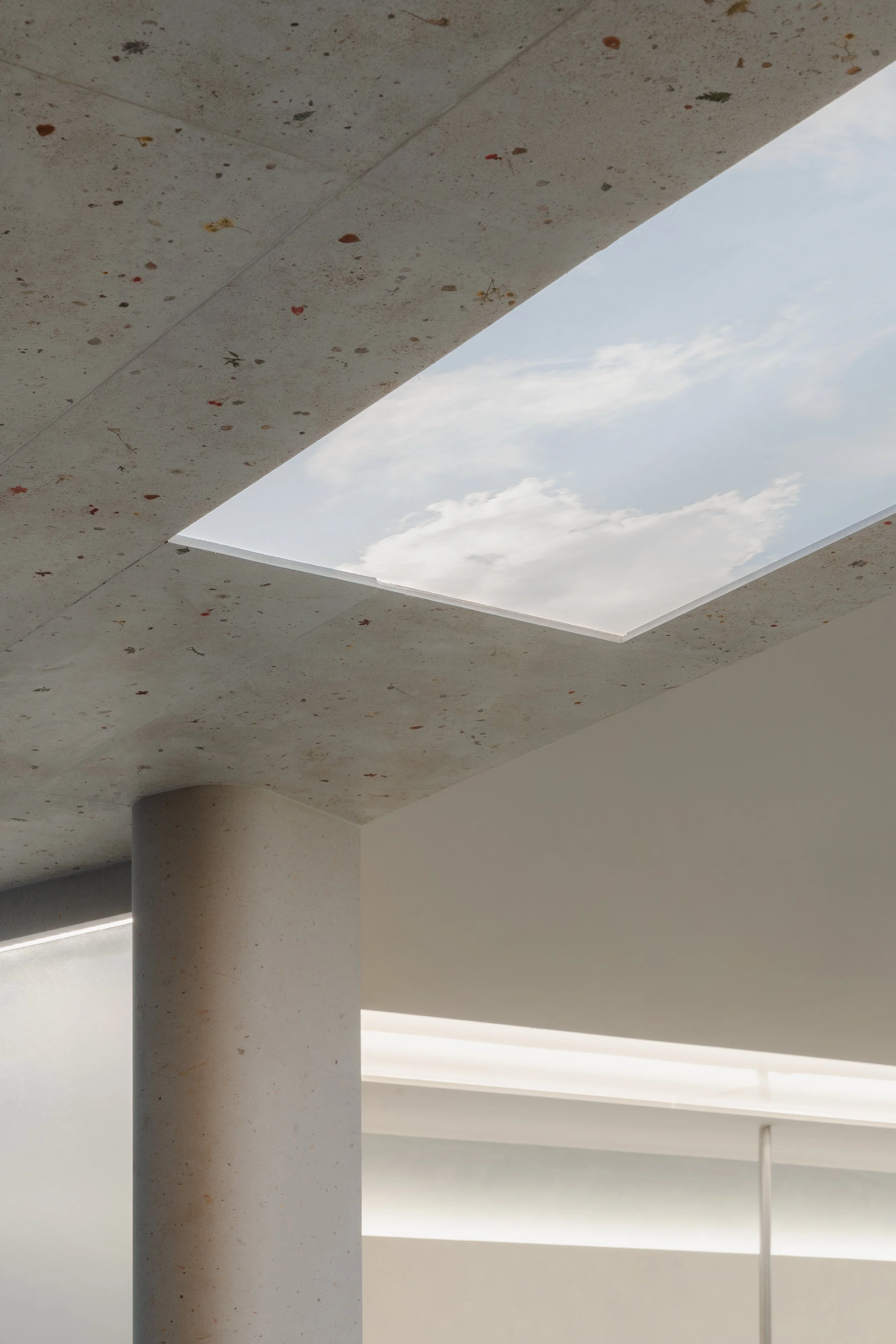
The Storefront
Reimagining the Brand
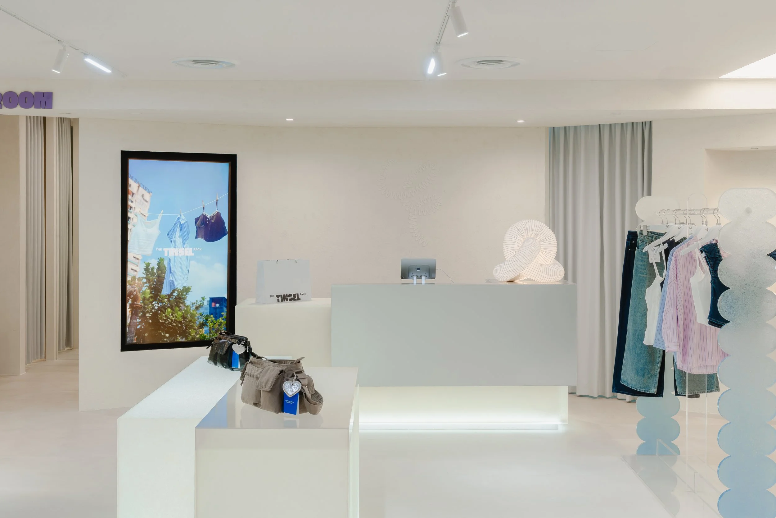
The store’s spatial language was developed around the idea of modern timelessness — clean lines, soft tones and detailing that give the space longevity beyond seasonal trends. Display elements are intentionally kept light and minimal. This allows the merchandise to take centre stage while maintaining a calm and cohesive retail environment.
The layout encourages a natural browsing flow, guiding customers through the space without feeling overly structured. Open sightlines make the store feel welcoming and approachable, while still providing clear areas for different product categories.
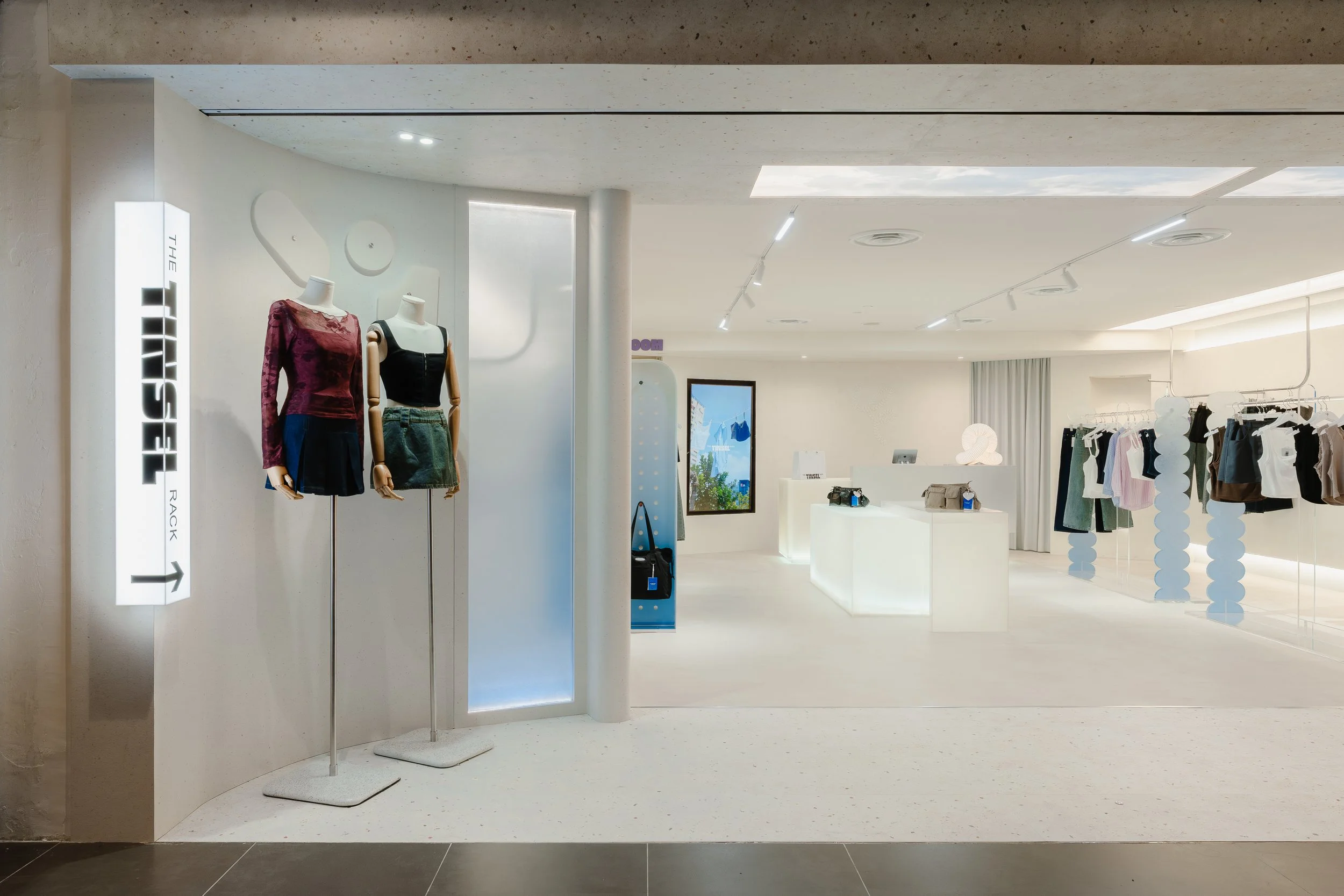
For a brand with a strong and loyal community, it was important that the store felt approachable rather than intimidating, a space customers could comfortably spend time in.
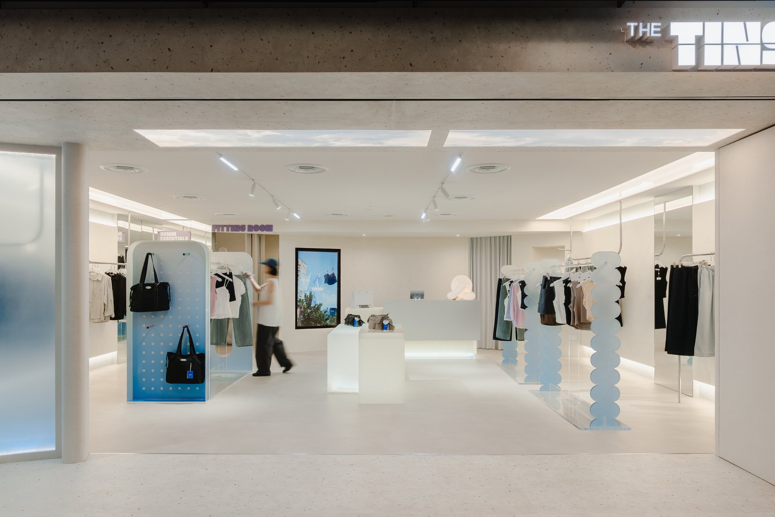
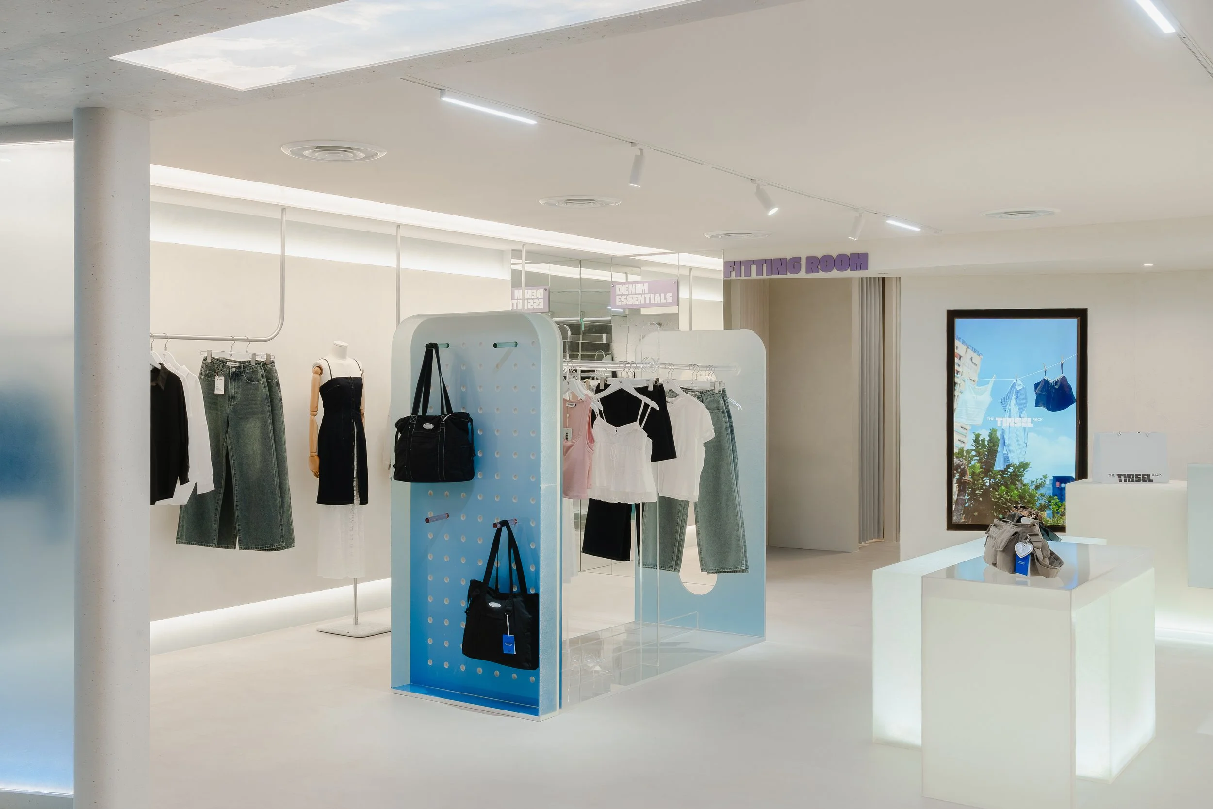
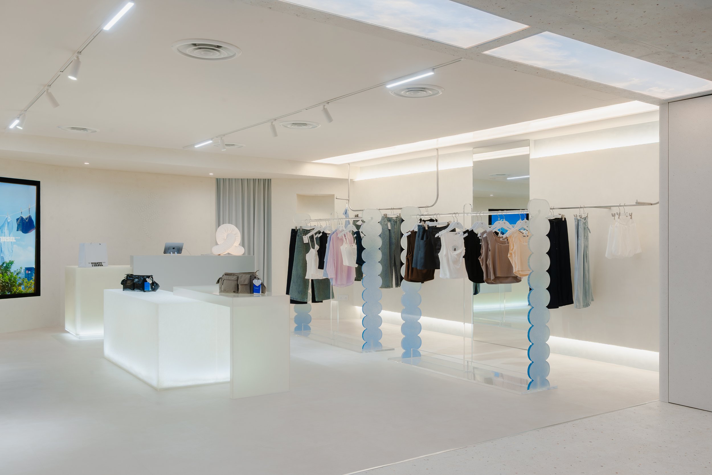
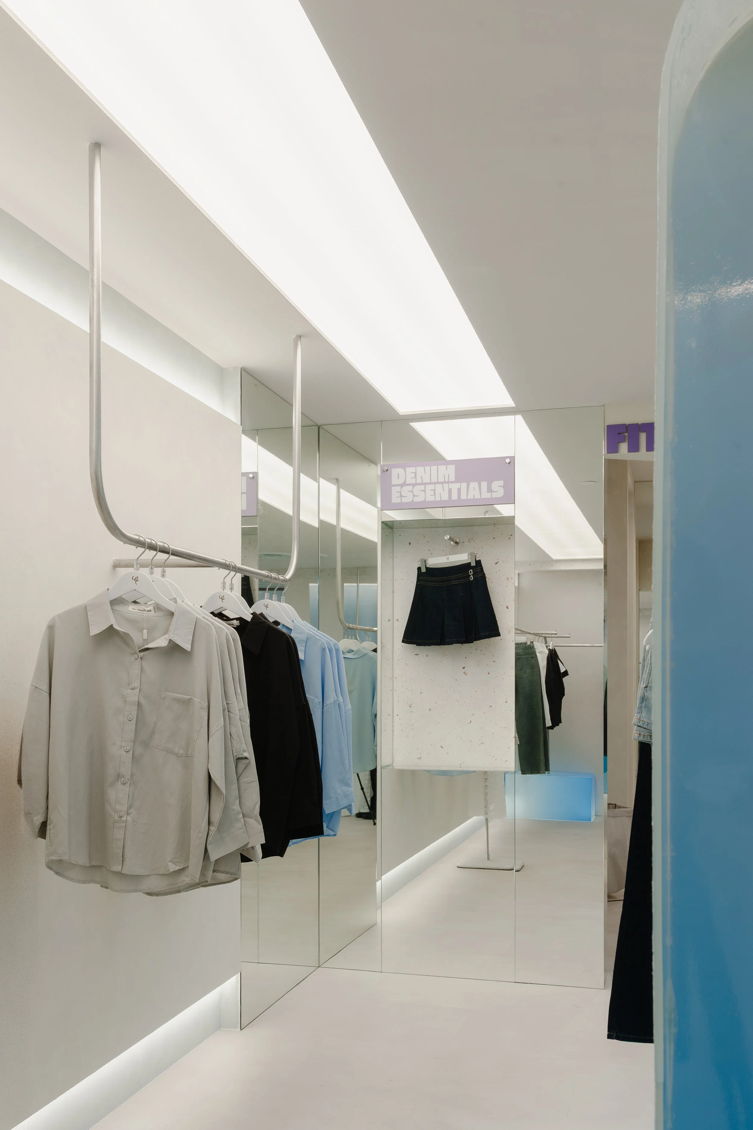
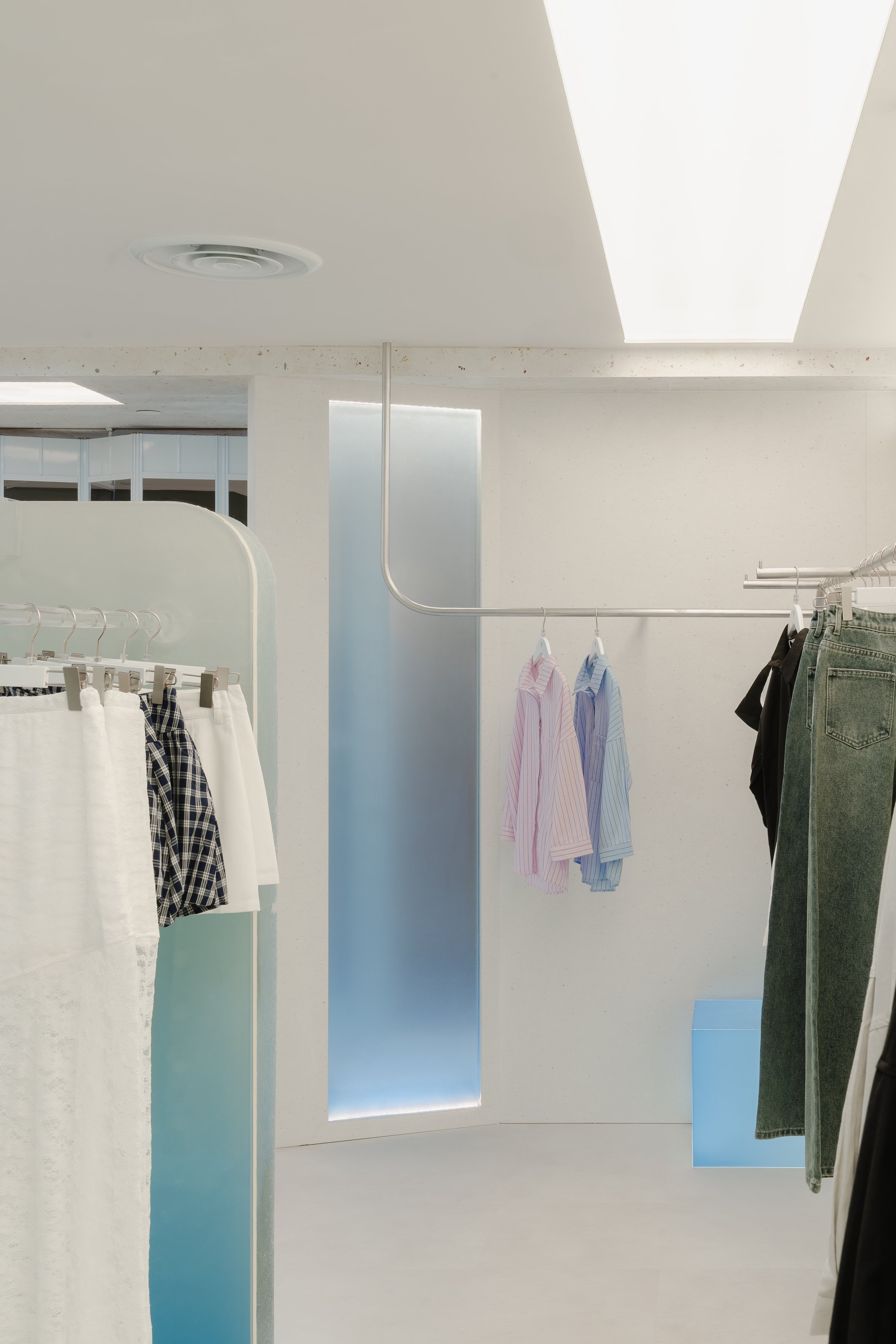
Custom Acrylic Display Elements
A key feature of the store is the use of custom-designed acrylic clothing racks and accessory displays.
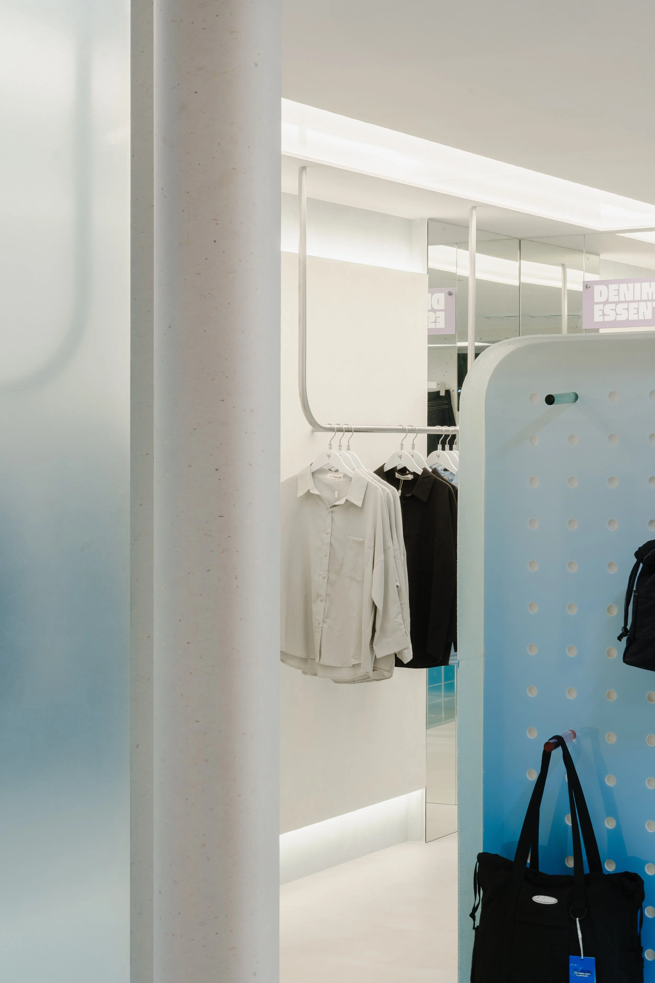
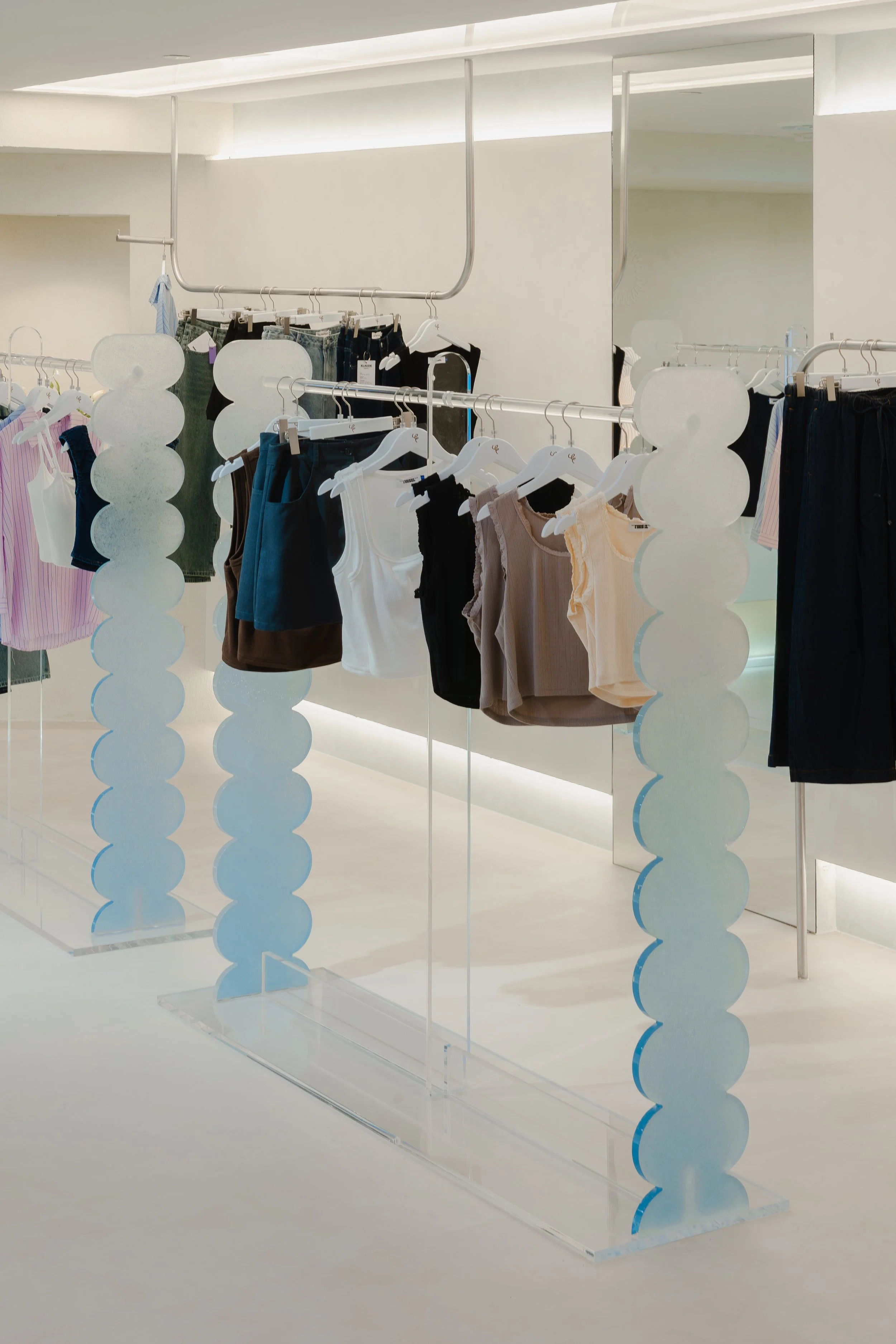
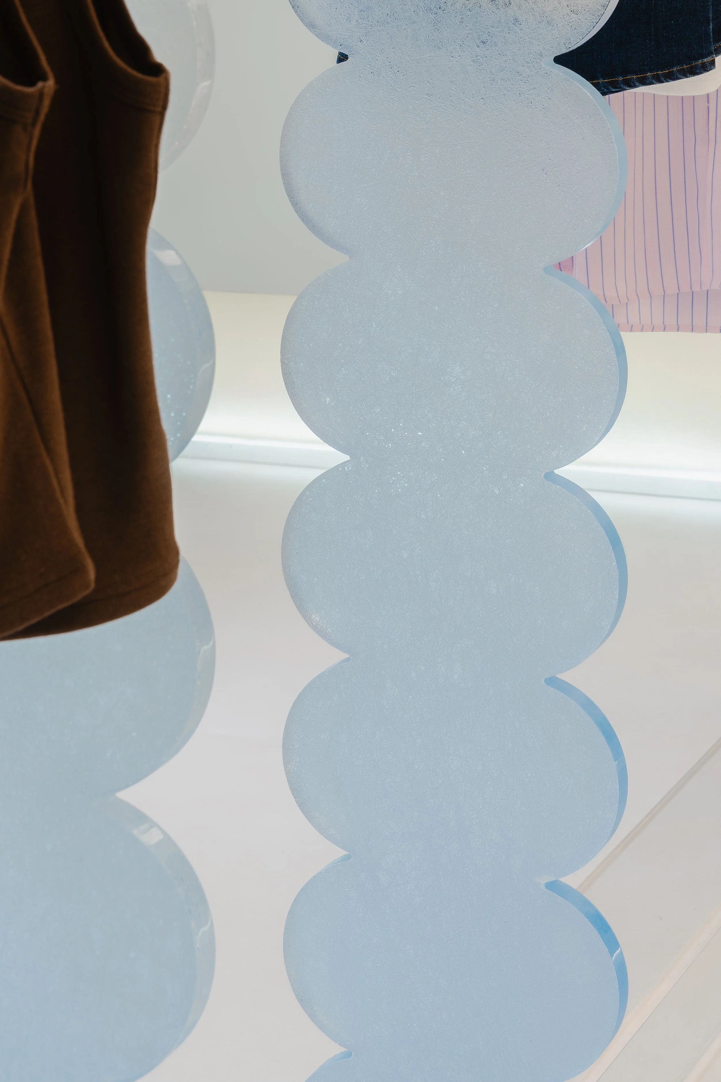
These elements were developed specifically for the space to achieve two goals: visual lightness and functional clarity. Acrylic allows the racks to almost disappear within the interior, ensuring that garments remain the primary focus.
At the same time, the material provides durability and flexibility for retail use. The transparency of the racks helps maintain an open and airy atmosphere throughout the store, preventing the space from feeling crowded even when merchandise levels are high.
A Fitting Room Designed for Confidence
In fashion retail, the fitting room experience plays a crucial role in how customers feel about the clothes they try on. For this flagship store, particular attention was given to lighting within the fitting rooms. The goal was to create the most flattering and natural environment possible for customers during try-ons.
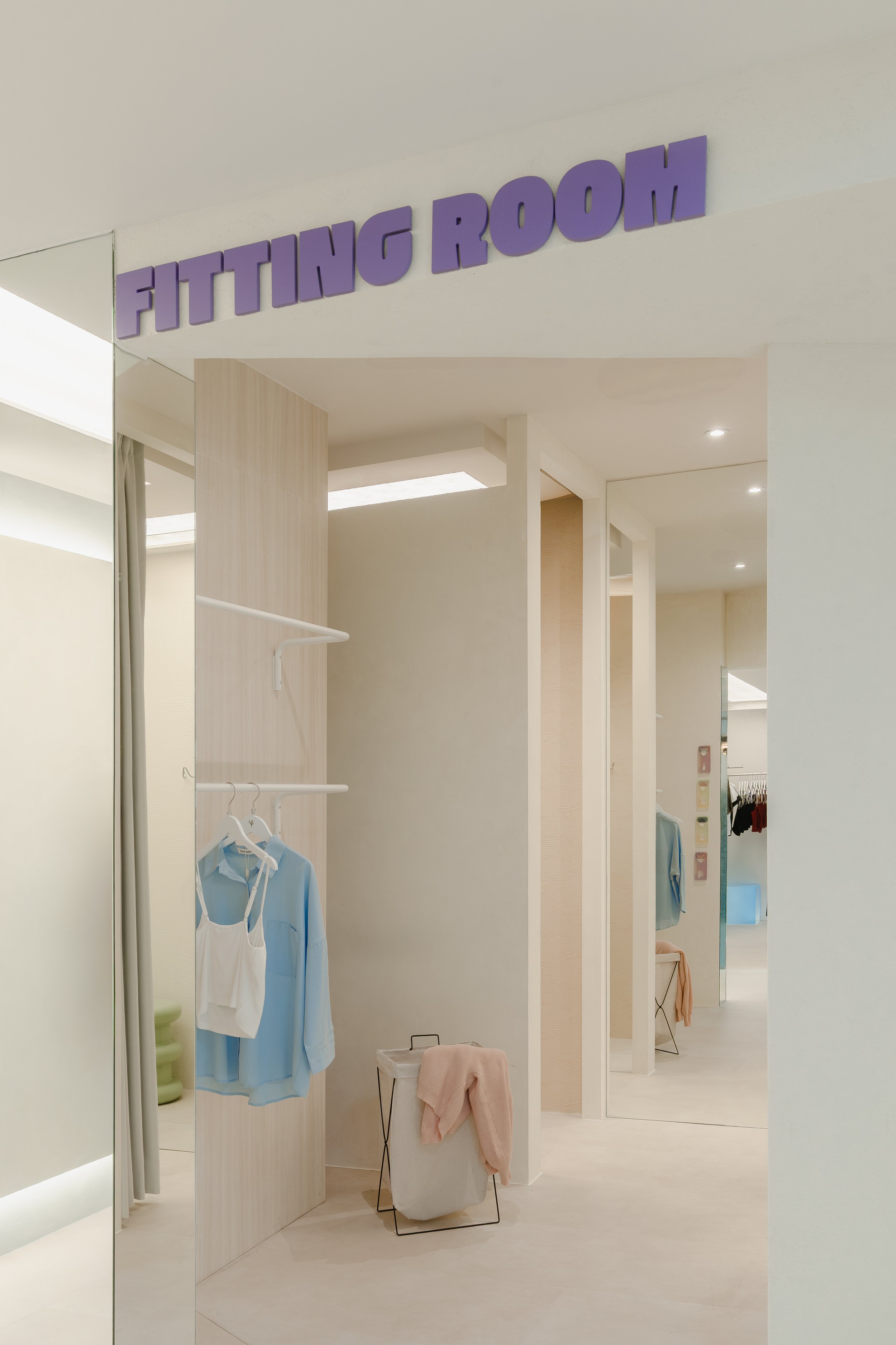
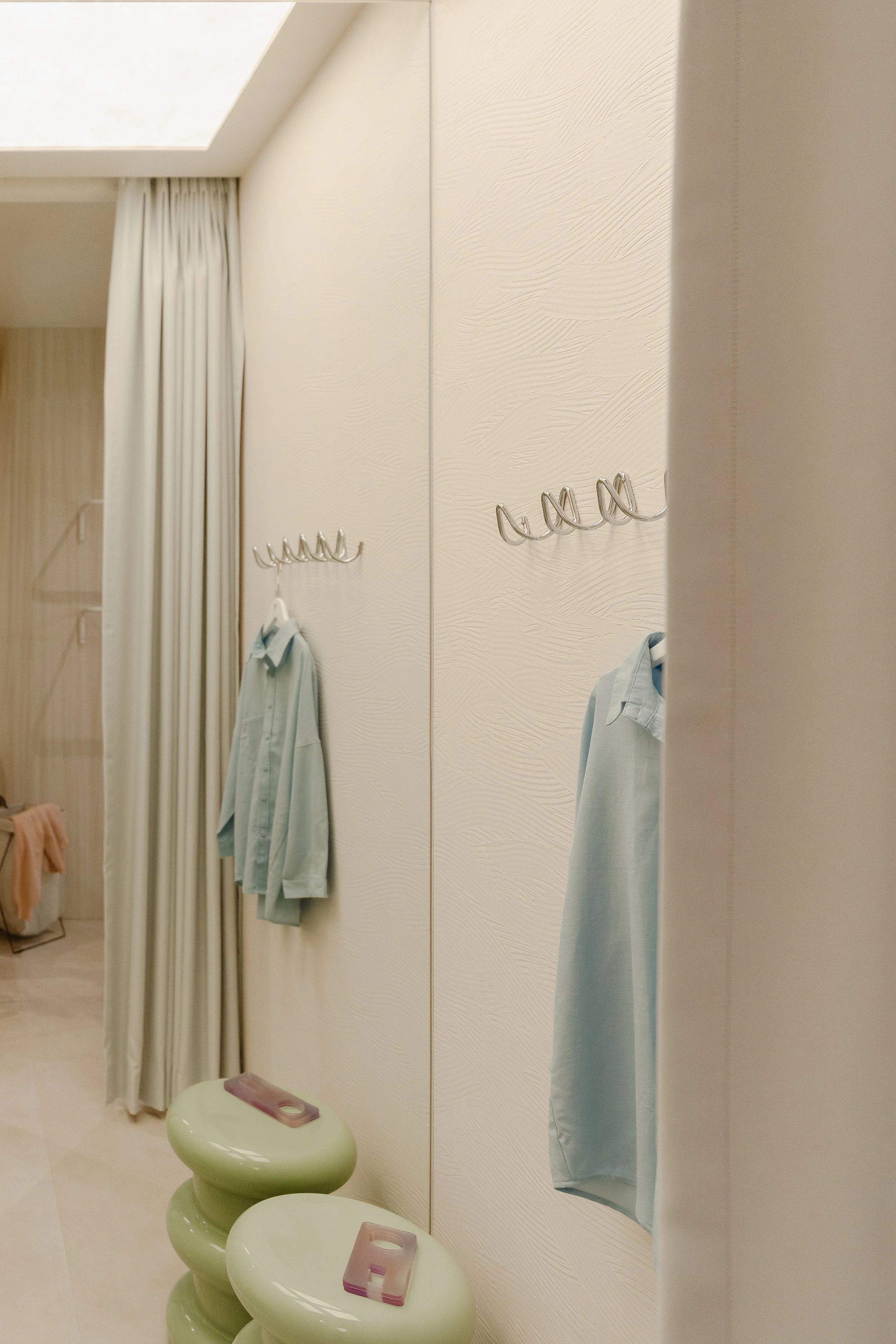
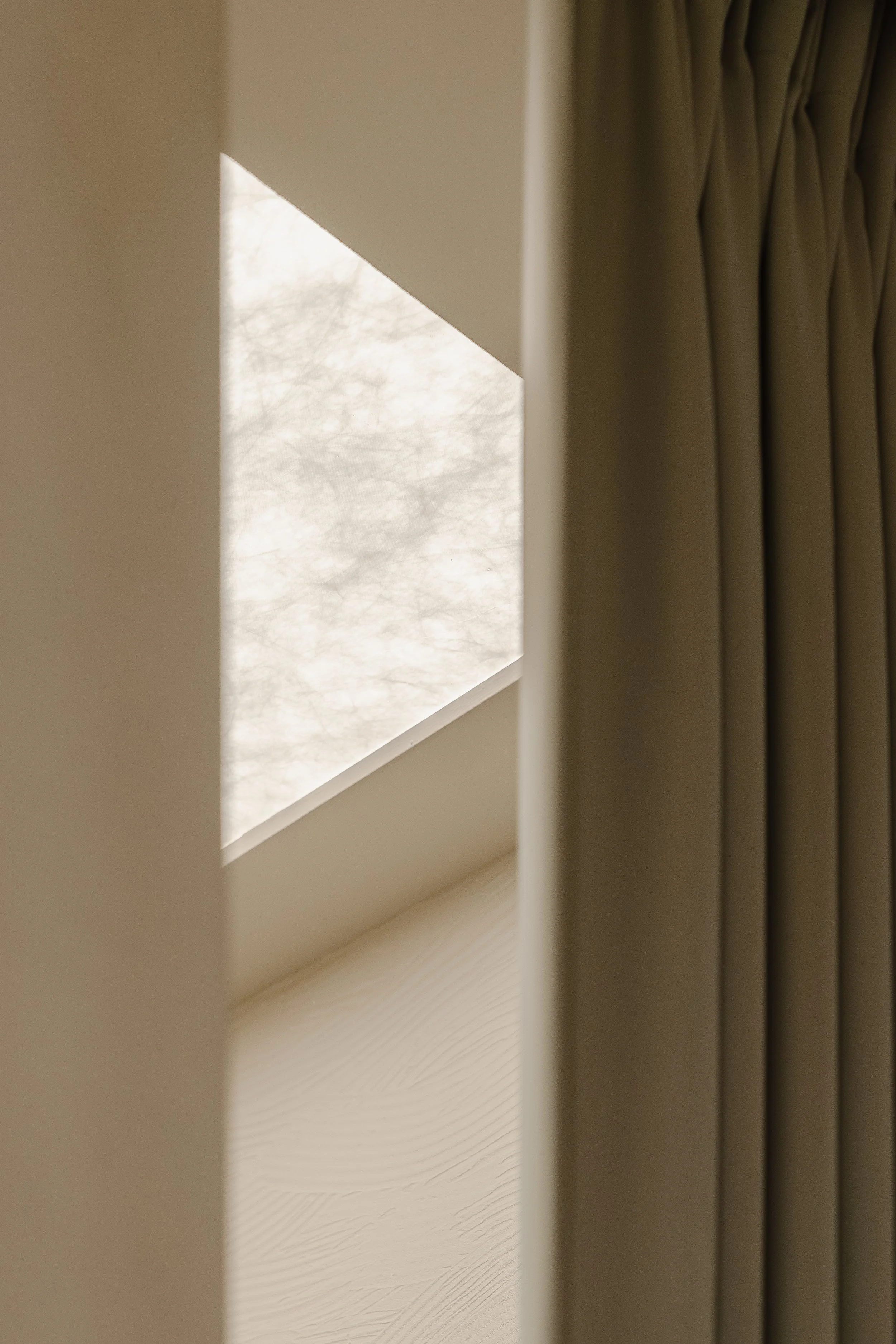
Carefully calibrated lighting reduces harsh shadows and provides a soft, even illumination that allows garments to be seen accurately while helping customers feel comfortable and confident. By prioritising this detail, the fitting rooms become more than just a functional space; they become an integral part of the overall shopping experience.
A Store Designed for Community
Beyond retail functionality, the flagship store represents an important milestone for the brand. It is a physical expression of the community that has grown alongside The Tinsel Rack over the years. The design therefore aims to create a space that feels familiar yet elevated, somewhere customers can explore new collections while still recognising the spirit of the brand they have supported.
Through thoughtful spatial planning, custom display elements, and carefully considered lighting, the flagship at Plaza Singapura becomes more than a store. It becomes a place that reflects the brand’s journey and the people who continue to be part of it.
If you’re inspired to transform your space, connect with our designers here —we’d love to bring your vision to life.
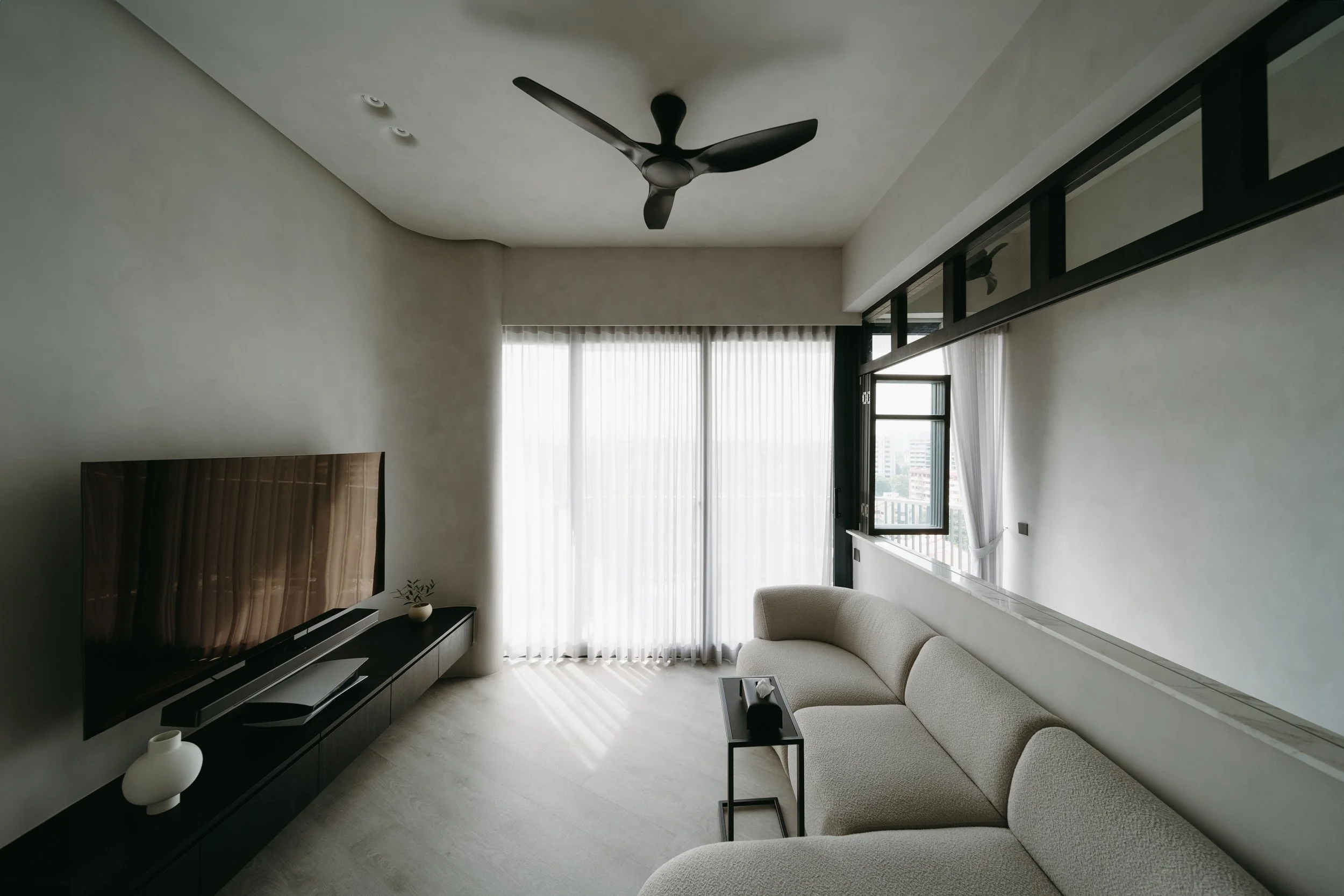
Quiet Living by the Bay
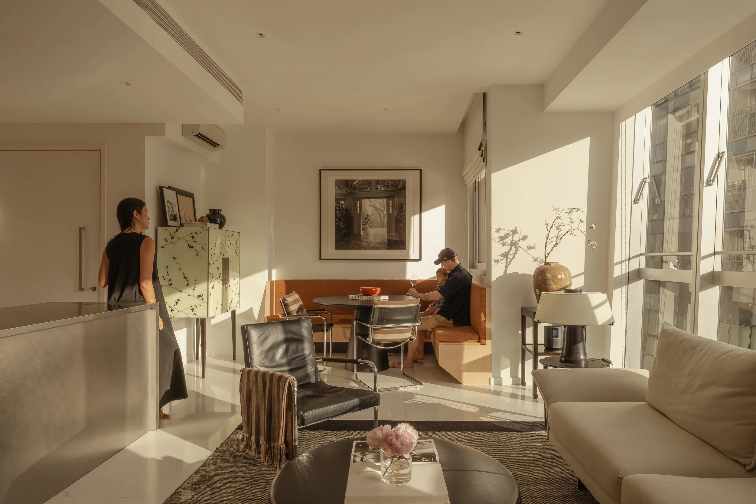
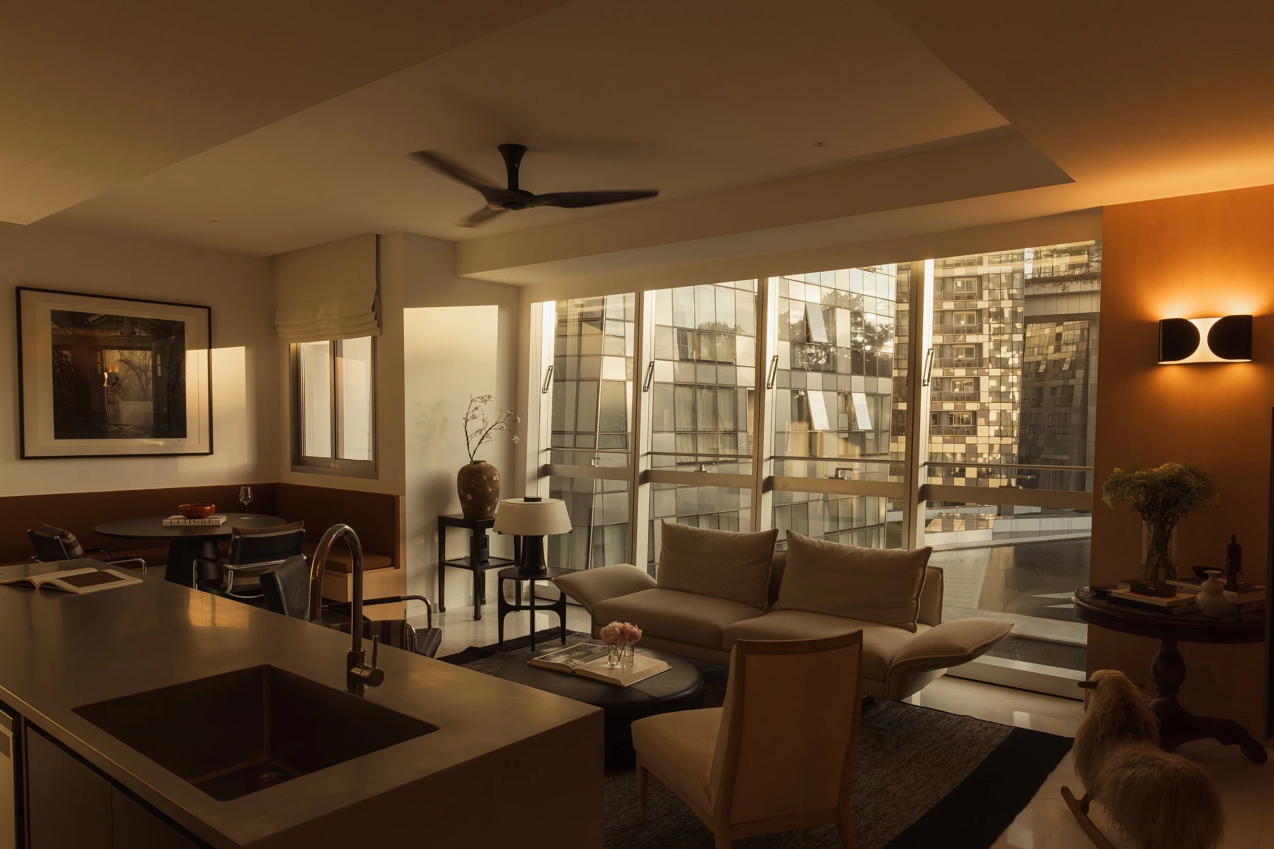
Located in Keppel Bay, this two-bedroom apartment was designed with a clear intention: to create a calm, cohesive home that highlights the surrounding architecture and views. With strong references to Park Hyatt Bangkok, the home combines the atmosphere of a quiet art gallery with that of a luxurious hotel lobby.
Reflections at Keppel Bay
Located in Keppel Bay, this two-bedroom apartment was designed with a clear intention: to create a calm, cohesive home that highlights the surrounding architecture and views. With strong references to Park Hyatt Bangkok, the home combines the atmosphere of a quiet art gallery with that of a luxurious hotel lobby.
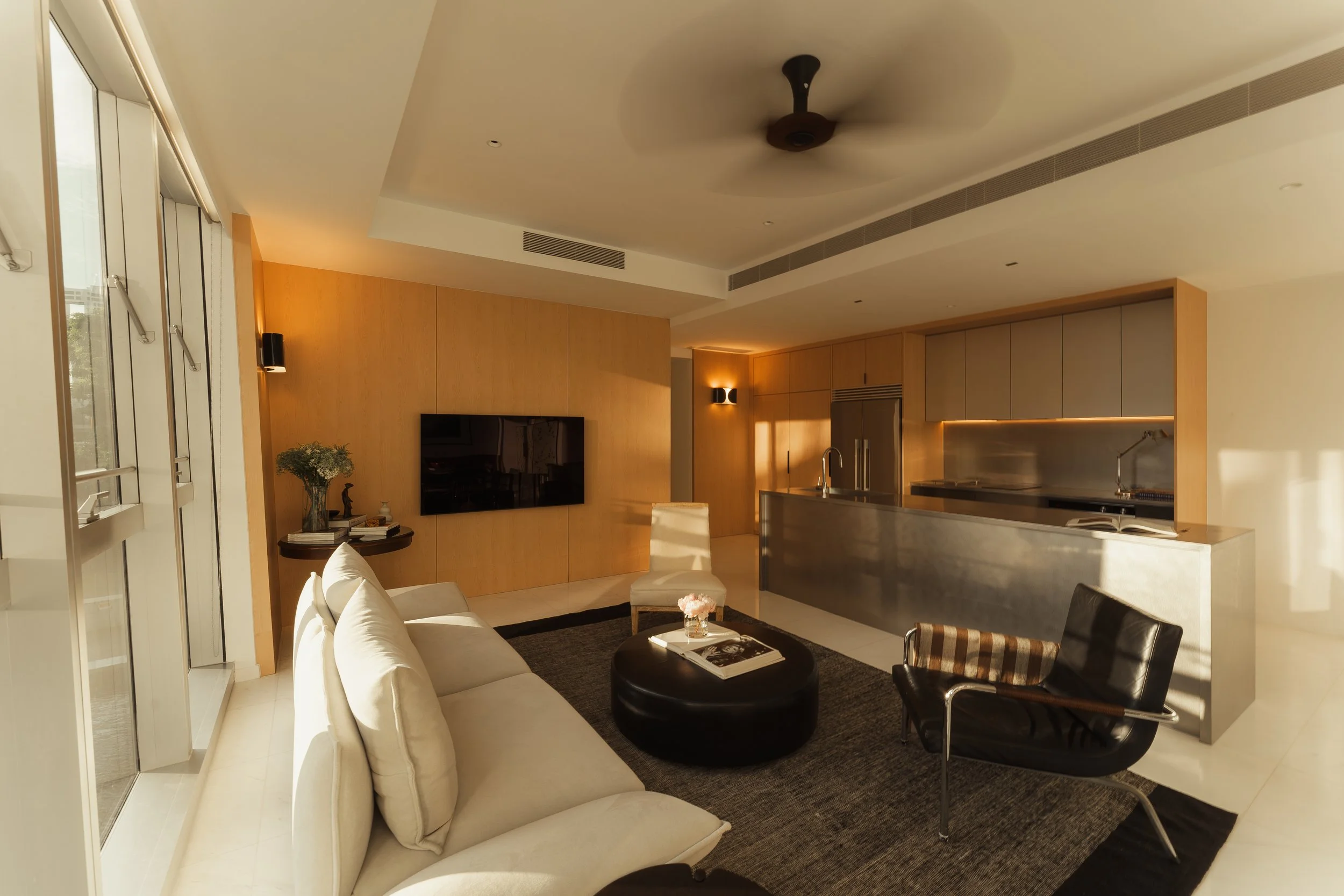
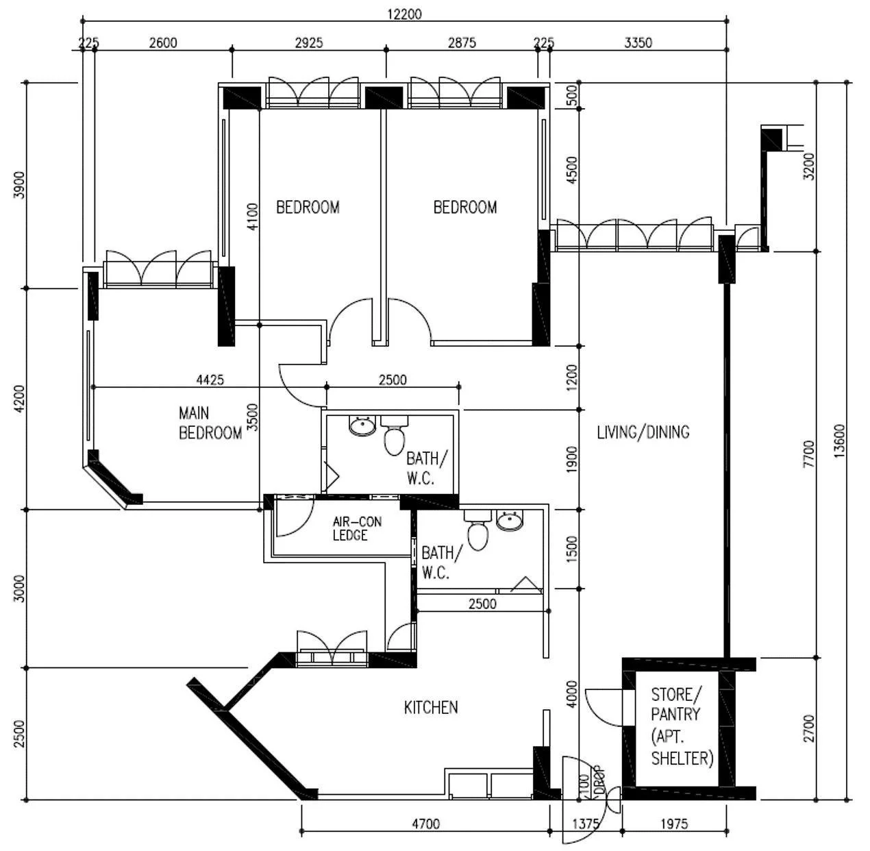
Spatial Planning
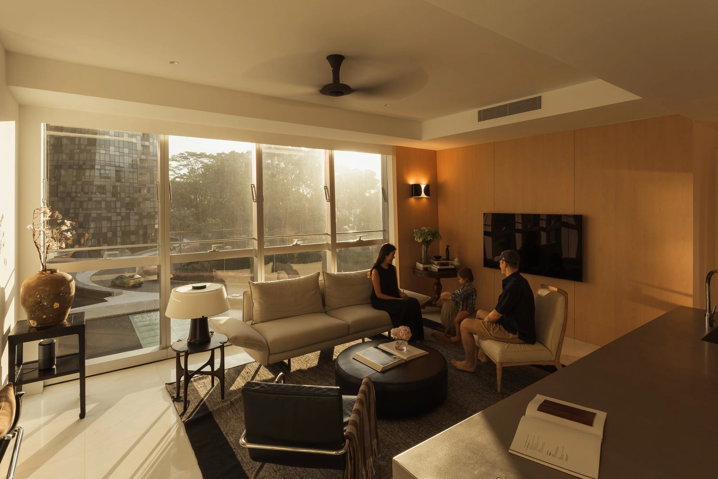
Like many condominiums in Singapore, the apartment’s footprint and long and narrow layout required careful planning to balance openness with practical storage. Instead of the conventional layout where the sofa faces the television, it now faces the kitchen island. This shifted the home’s focal point to the heart of daily life, where cooking, eating, and conversations happen, which visually opened up the space, making it feel larger and more connected.
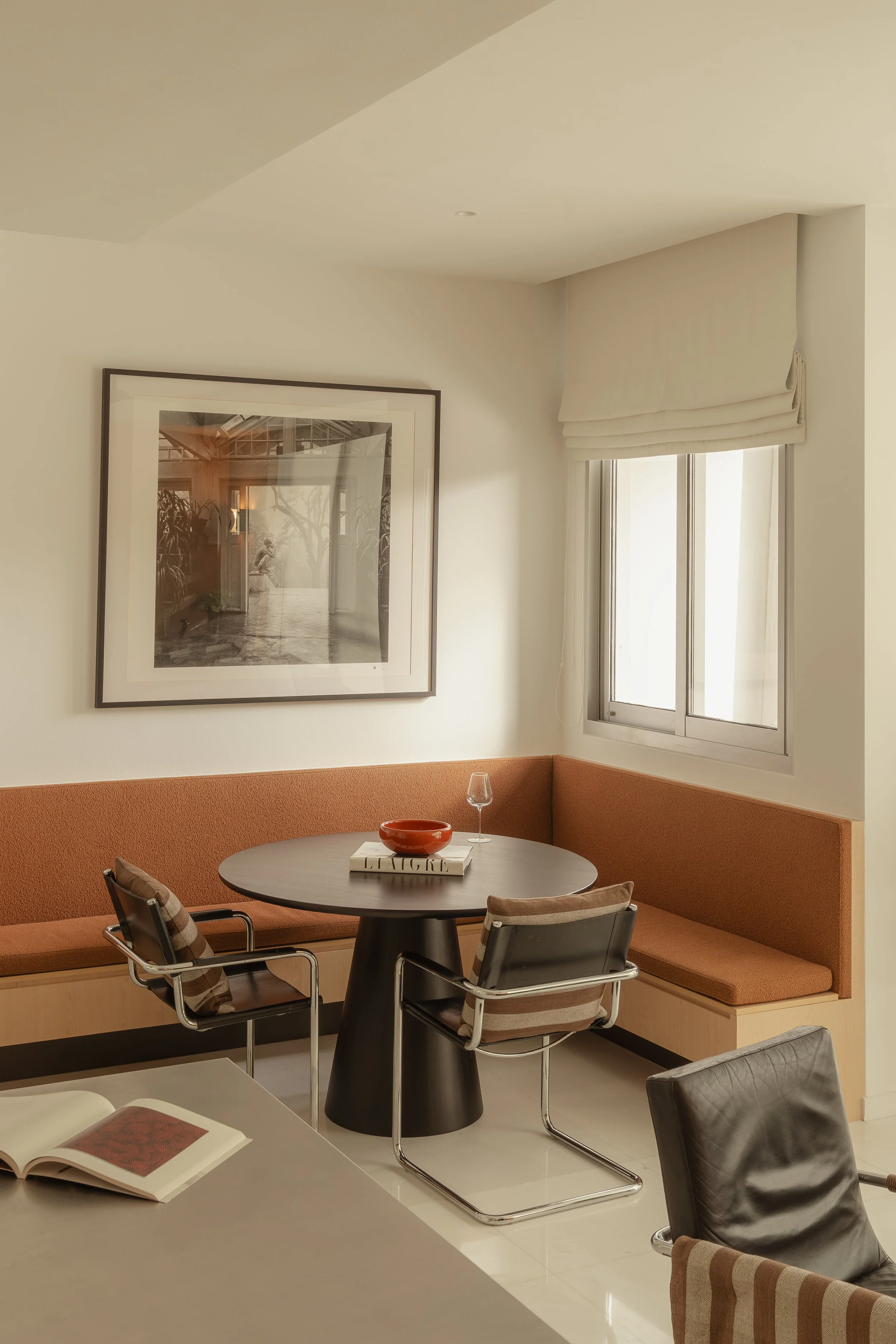
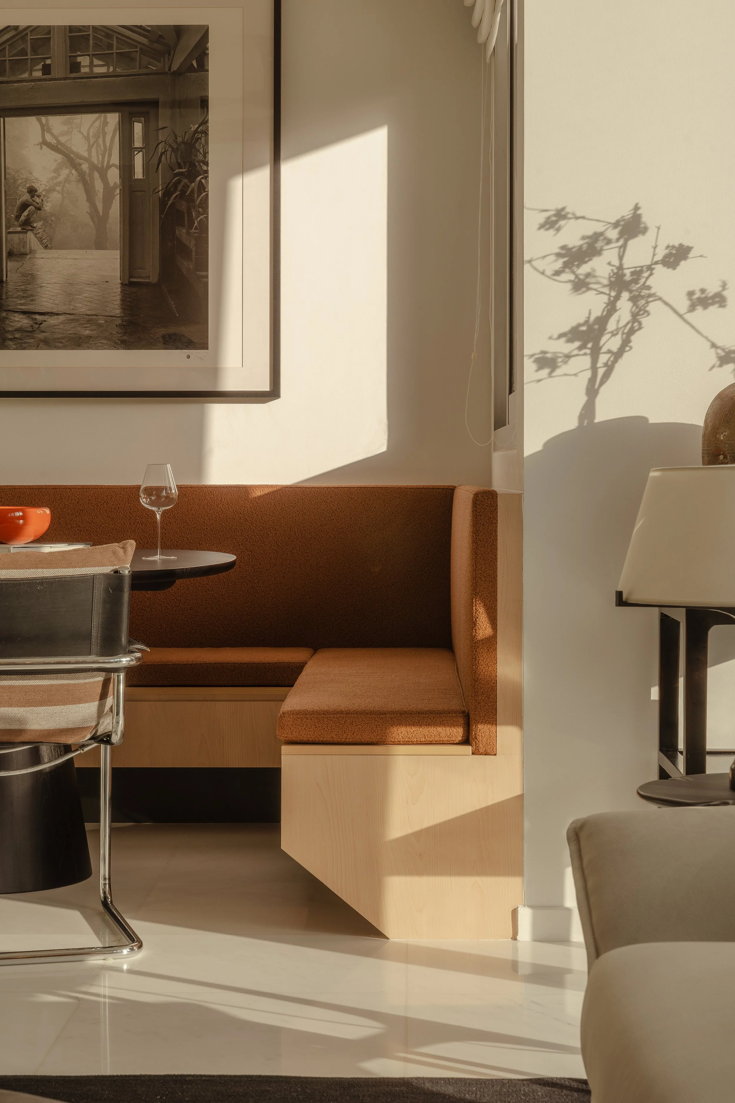
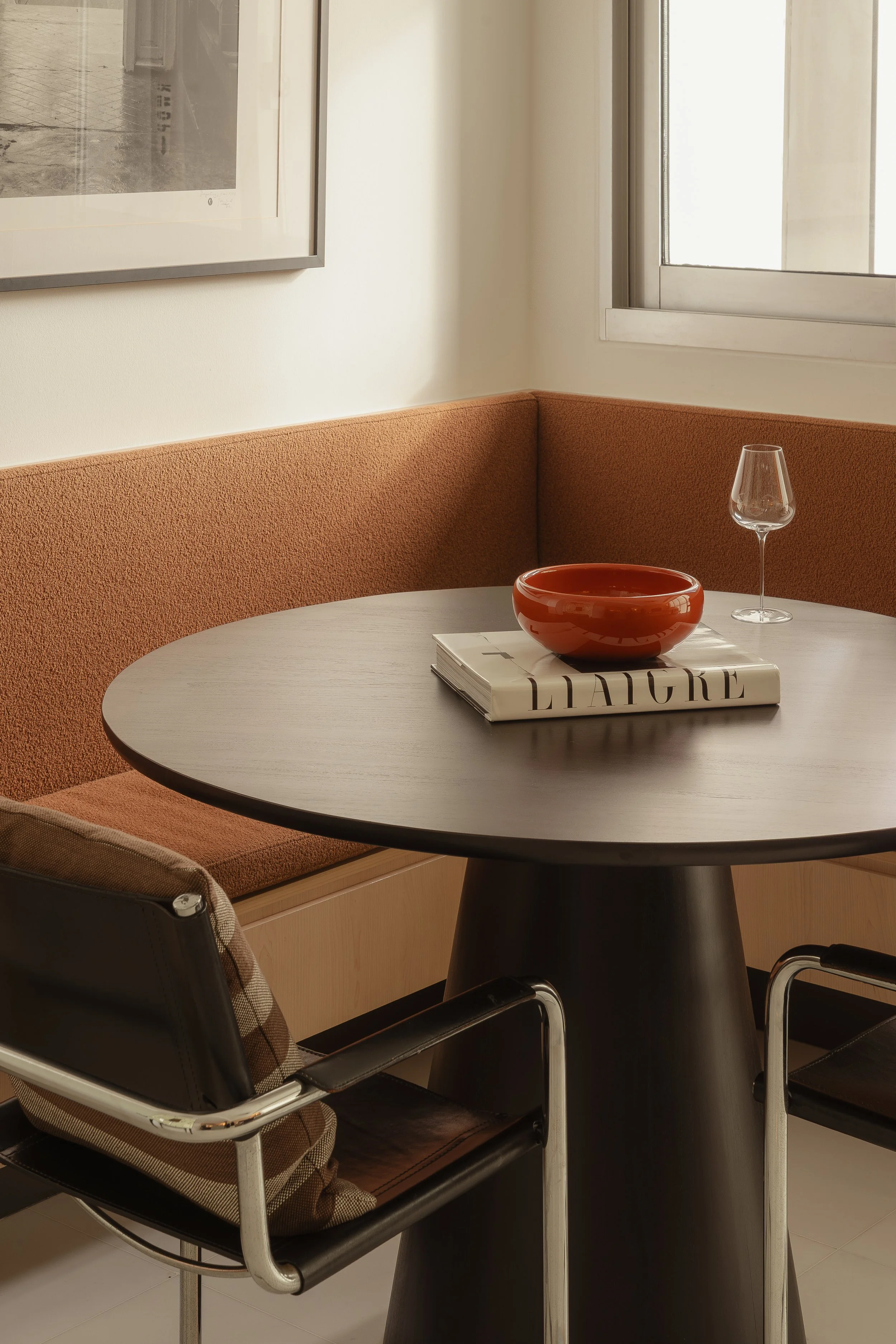
Dining Banquette
To anchor the open-plan area, the dining banquette became a central feature. It’s intimate yet integrated with the rest of the space; the owners planned to frame a large artwork there, which became the perfect focal point. The upholstered seat introduced a subtle touch of colour, a soft counterpoint to the otherwise neutral palette, bringing warmth and personality while maintaining the home’s elegance.
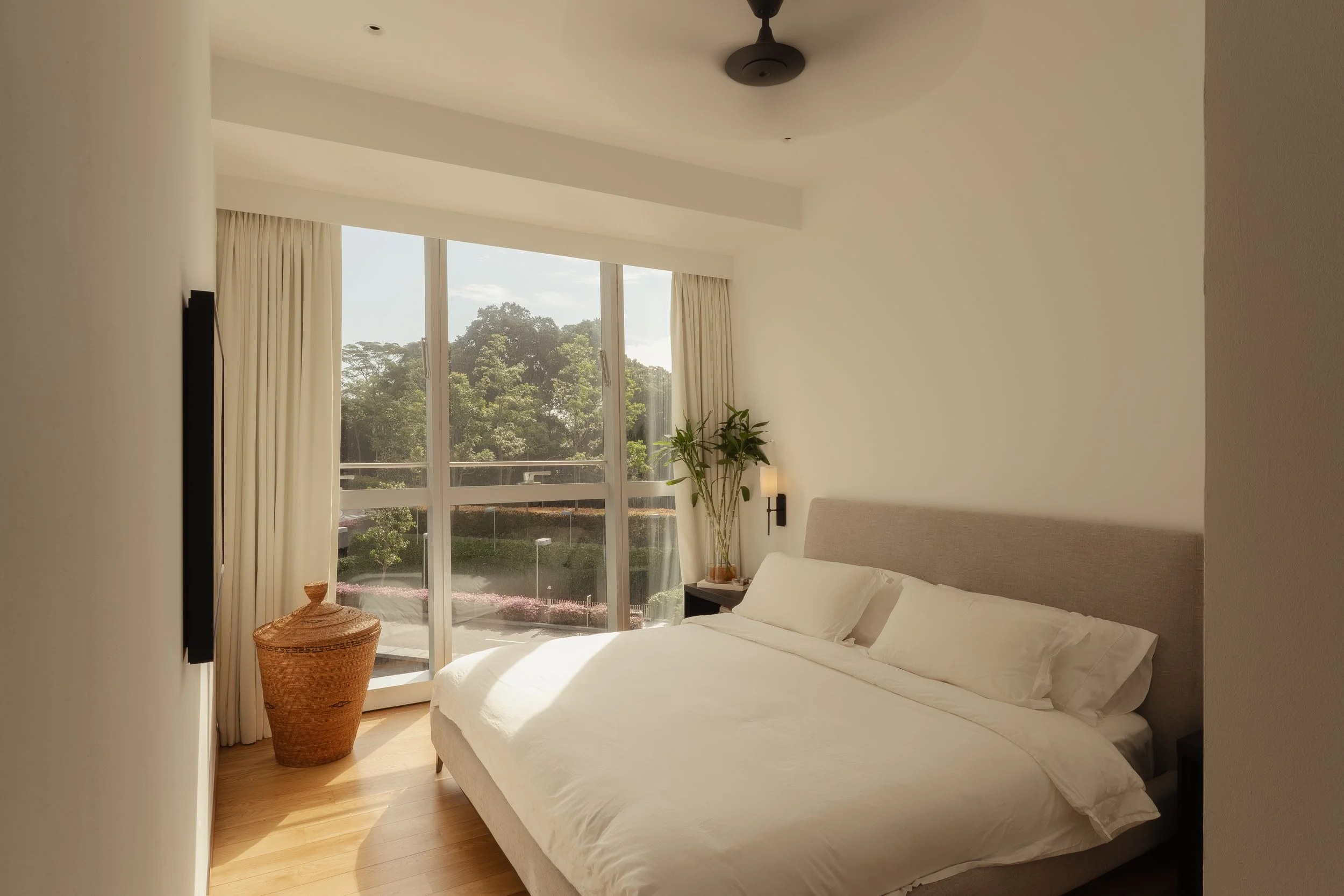
Bedrooms
The bedrooms were designed with simplicity and comfort in mind. A restrained palette of neutral tones creates a restful environment while allowing natural light to shape the atmosphere of the space throughout the day.
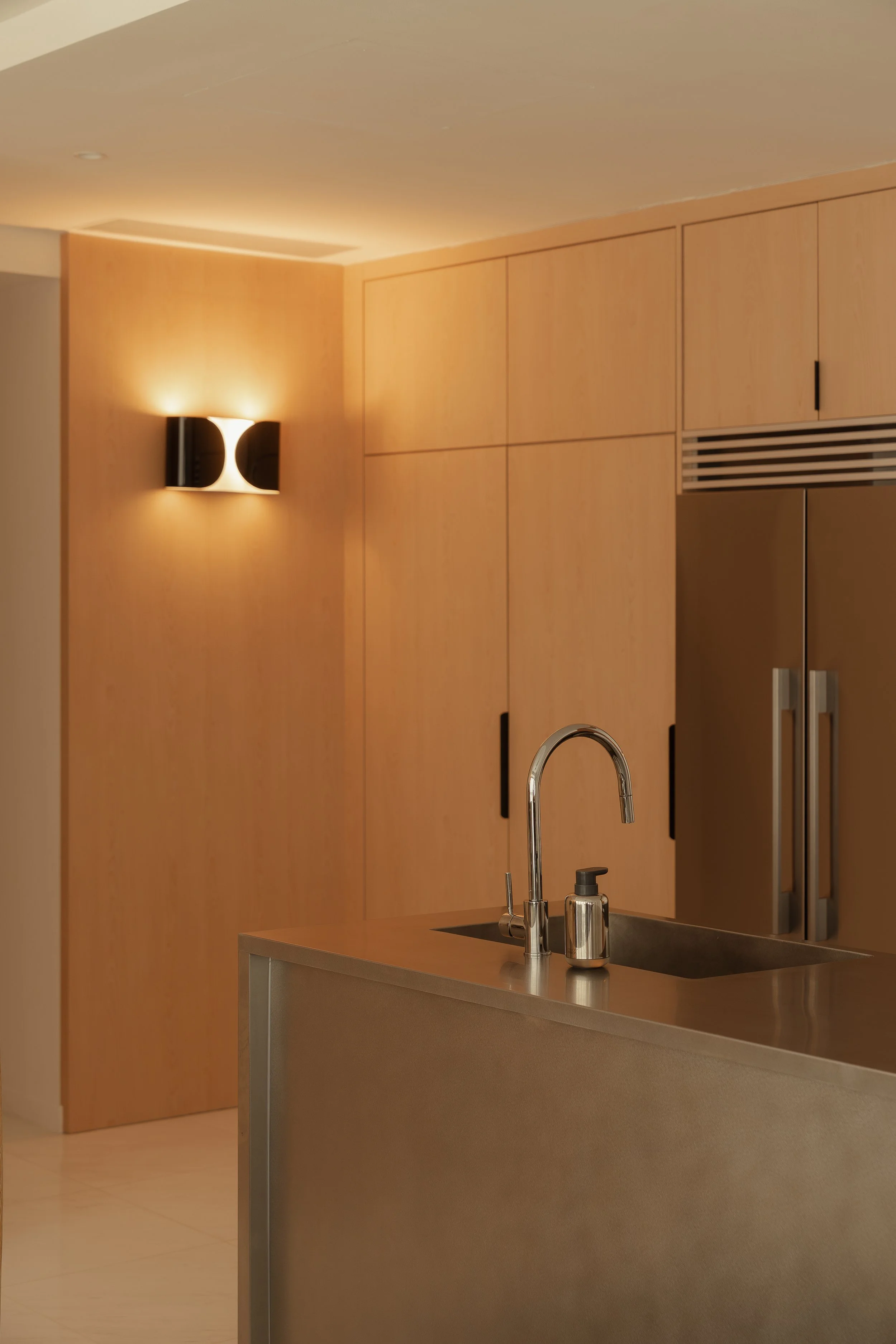
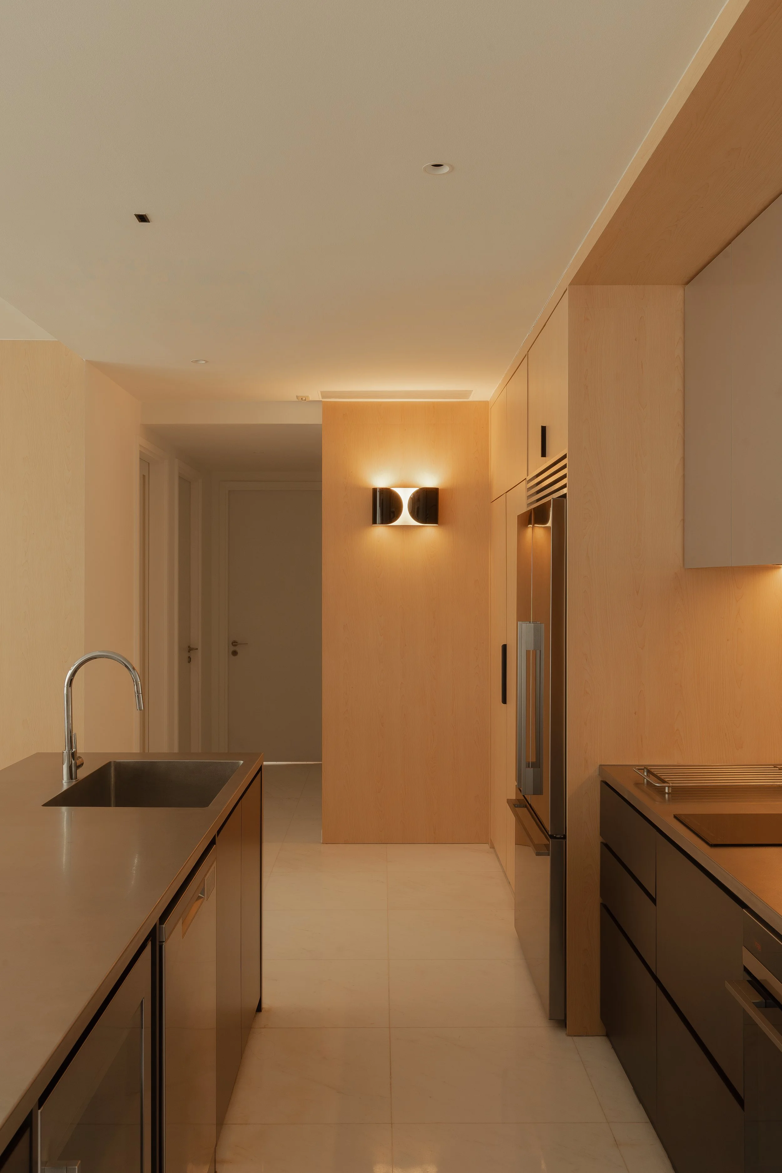
Palette
Searching for the perfect shade of wood was a priority, something that had warmth without heaviness. The veining and tone were important to ensure it sat harmoniously with the apartment's neutral envelope. Pairing that with stainless steel finishes created a subtle interplay between warmth and coolness, matte and sheen, forming a sense of balance that feels both composed and lived-in.
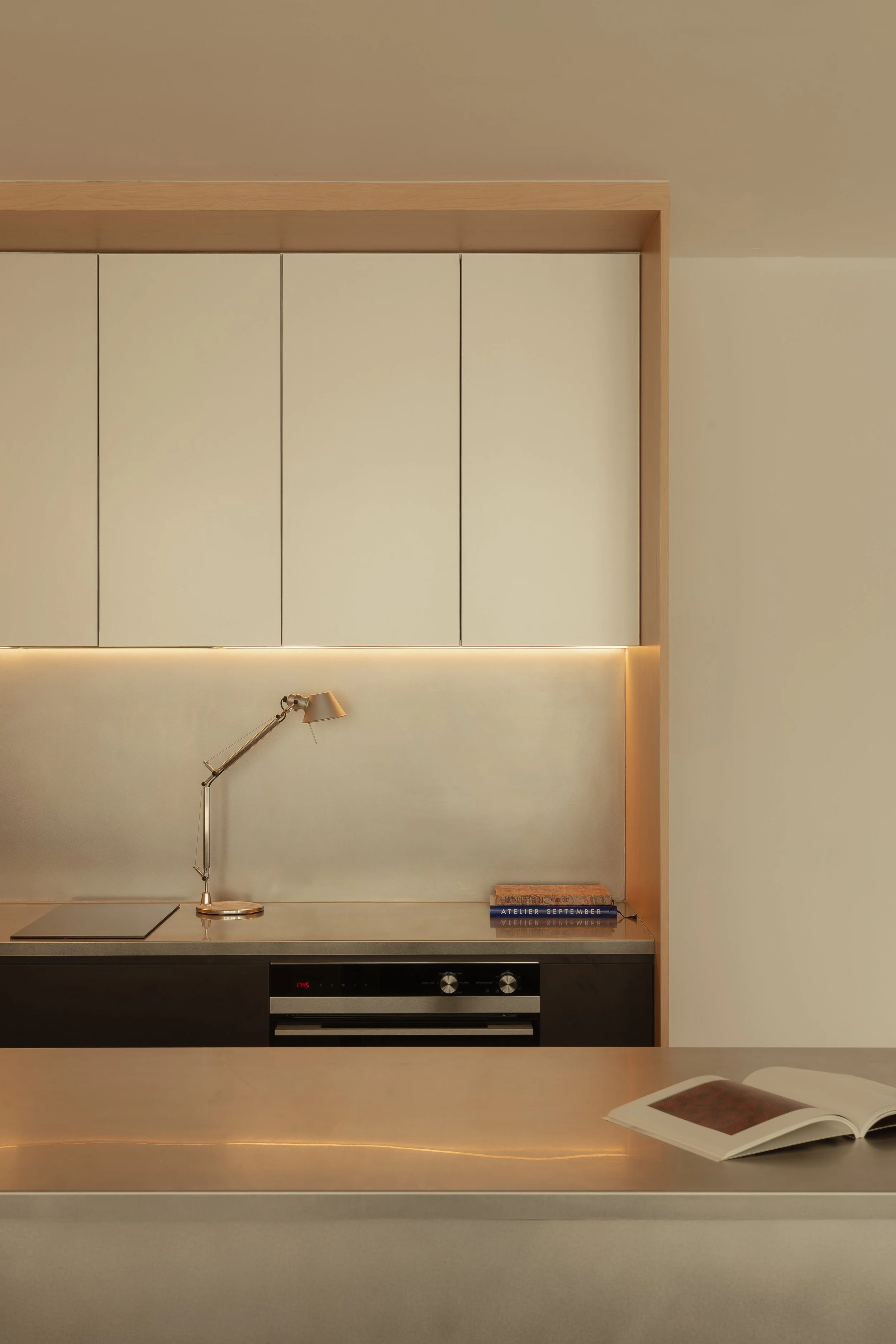
Every line, junction and material transition was carefully considered, yet the home doesn’t feel stark or too cold to live in. Given that the family now lives in and enjoys the space, it truly feels like a reflection of them, which is always the most rewarding outcome.
If you’re inspired to transform your space, connect with our designers here —we’d love to bring your vision to life.
Finalist in the Design Anthology Awards 2025, Residential Living Spaces (Compact)
Featured on Home & Decor: A Park Hyatt–inspired renovation transforms a young couple’s 2-bedroom apartment in Reflections at Keppel Bay
Featured on Lookbox Living: Hotel-like comfort at Reflections at Keppel Bay

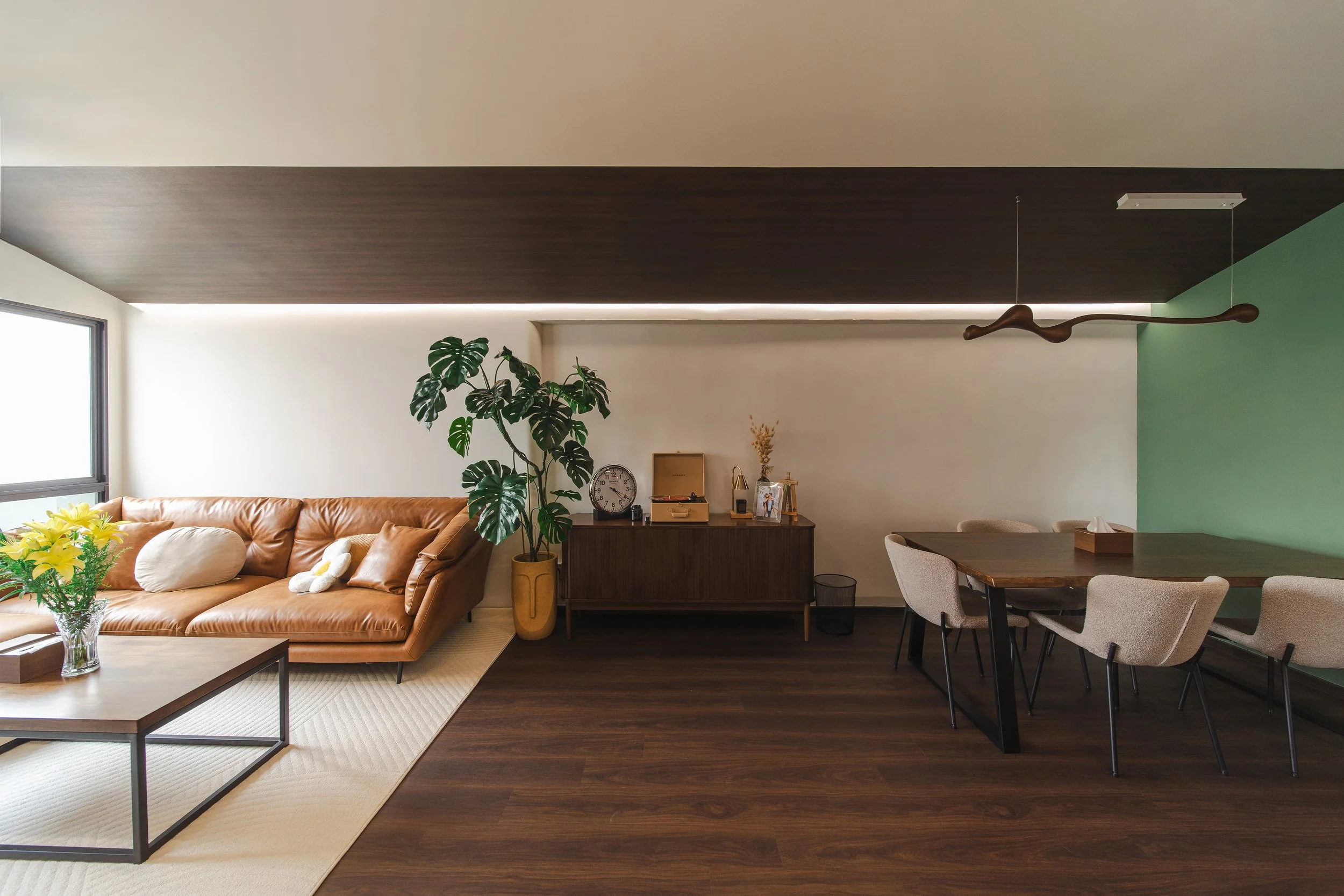
A Fireplace-Inspired Home in Woodlands
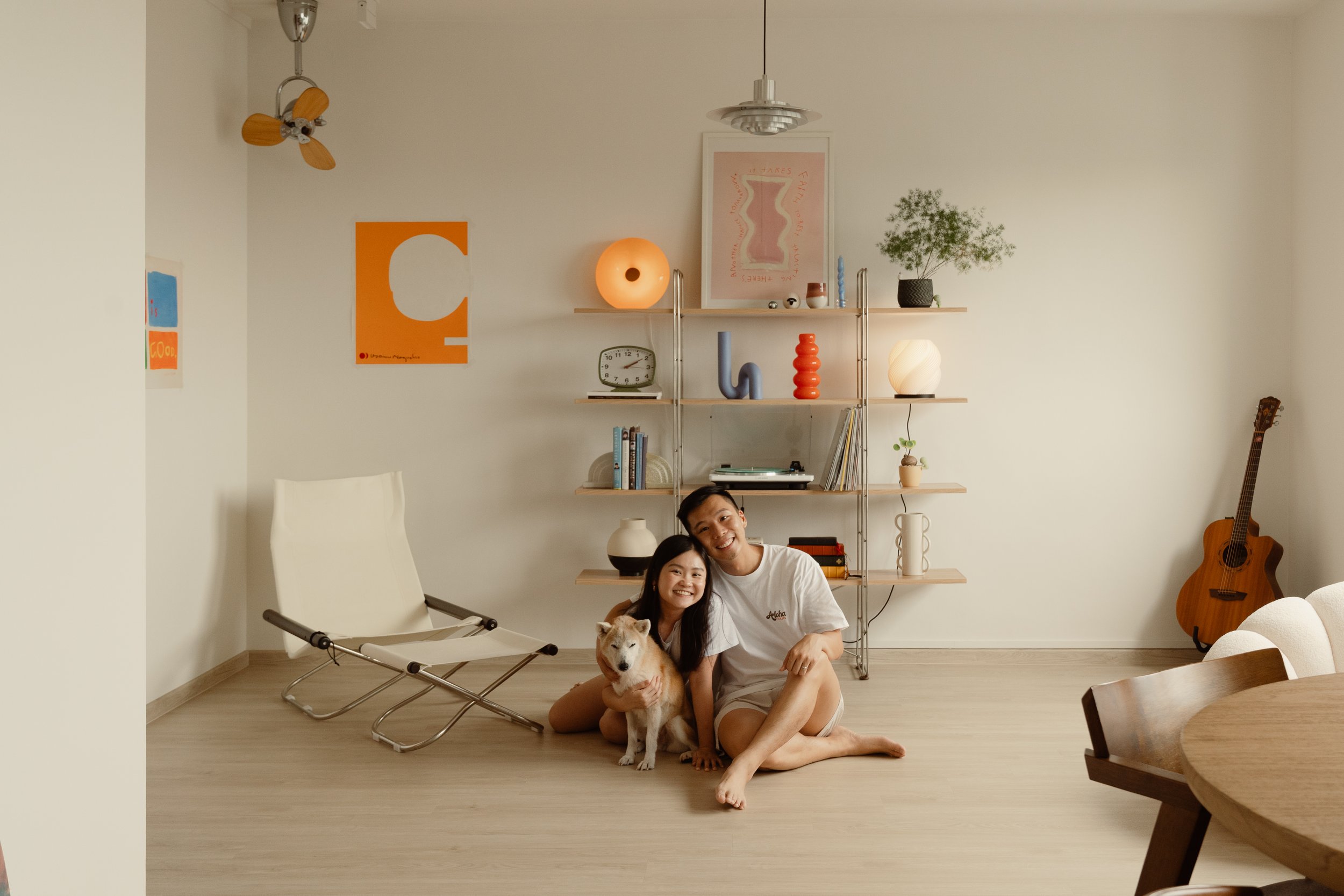
Nestled in the quiet charm of Woodlands, this home was designed for a young couple eager to carve out a space that truly reflected their rhythm and routines. Every element was intentionally designed to balance form and function — creating zones that flow intuitively while anchoring meaningful moments.
587 Woodlands Drive 16
Nestled in the quiet charm of Woodlands, this home was designed for a young couple eager to carve out a space that truly reflected their rhythm and routines. Every element was intentionally designed to balance form and function — creating zones that flow intuitively while anchoring meaningful moments.


Entrance & Kitchen
The floor plan presented an interesting challenge: the main entrance opened straight into the kitchen. The homeowners wanted a clear foyer and a wet-dry kitchen layout, so we had to get creative. We introduced a built-in settee — doubling as both a landing spot for shoes and a visual cue for the entry. Concealed bomb shelter doors on one side keep shoe storage discreet, while an extended countertop provides extra storage and links directly into the dry kitchen space.
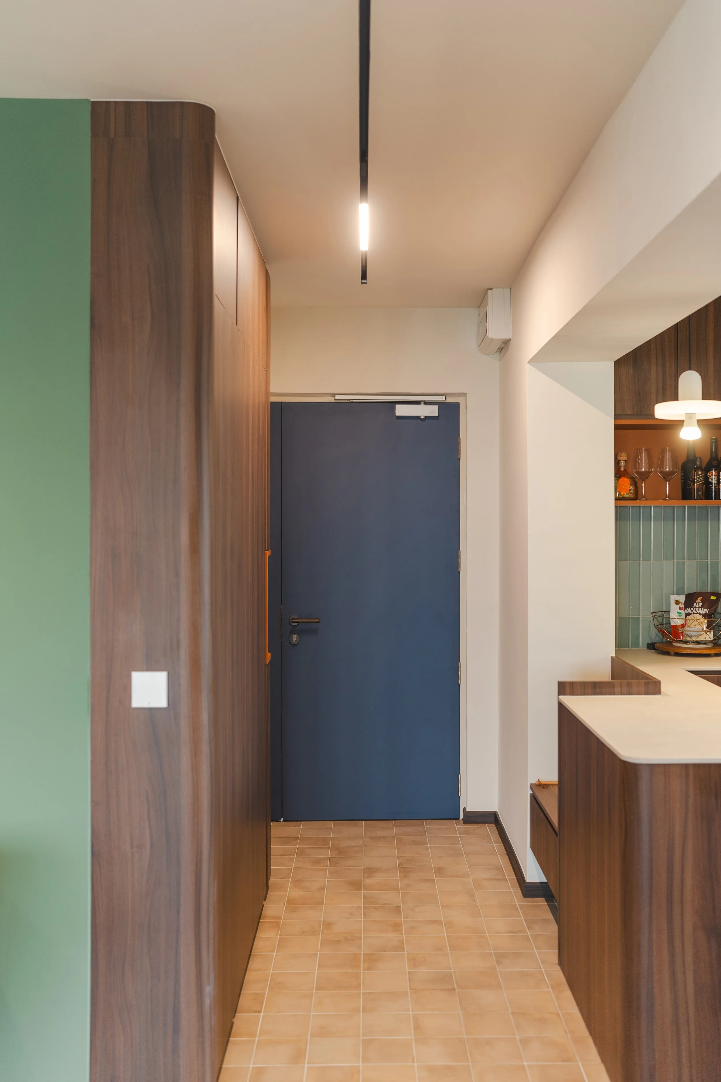

Glass sliding doors separate the wet and dry zones. They tuck away neatly behind the fridge, keeping the space open when needed but easily sectioned off during heavier cooking. The backsplash—adorned in vivid turquoise tiles—ties both zones together, offering a pop of colour that the homeowners fell in love with. “We wanted to recreate the feeling of a fireplace in our home,” they shared. The warm, earthy palette layered with rich wood tones evokes a comforting sense of hearth and home.


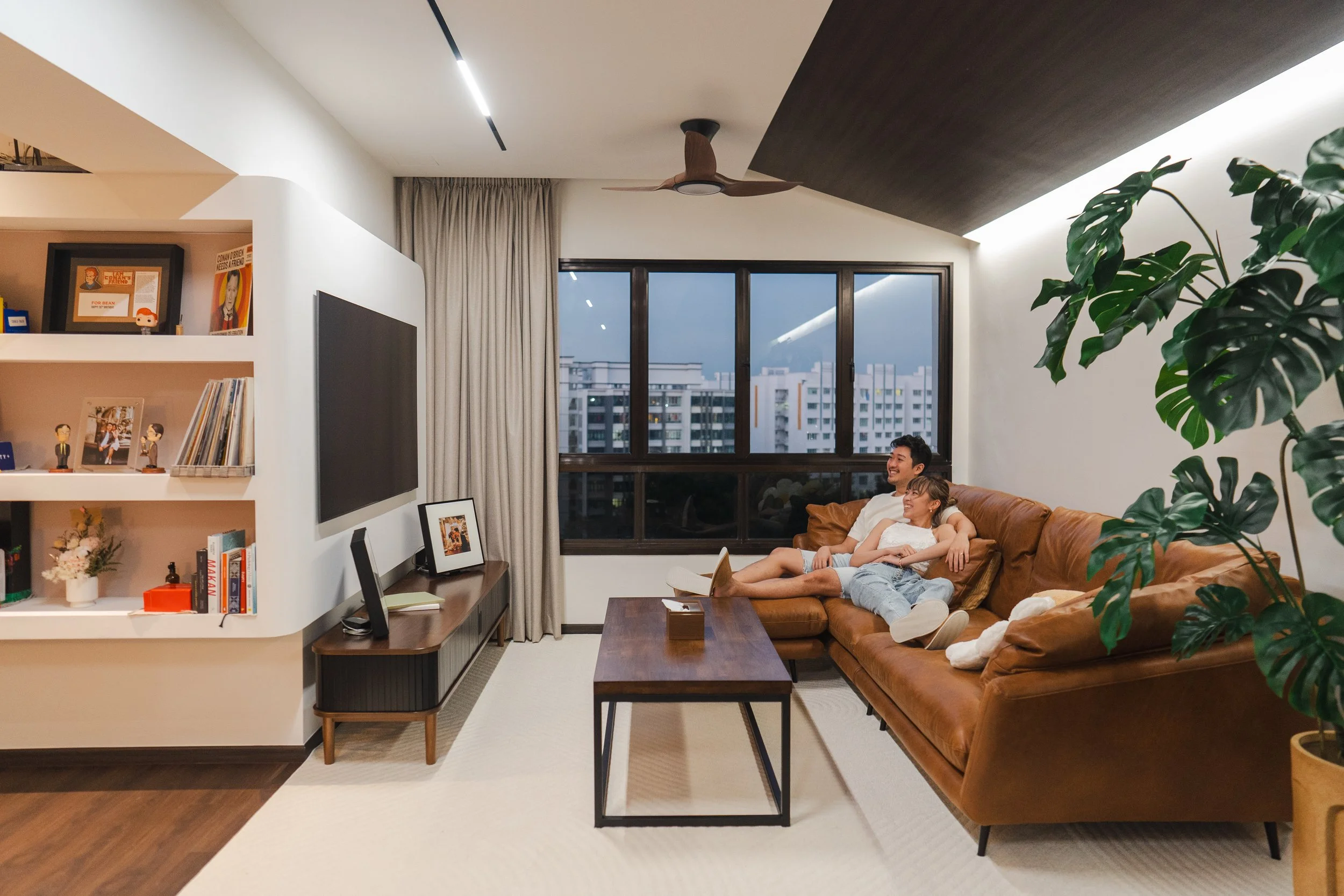
Living
The living area was designed to invite long conversations, gaming nights, and cosy weekends. Slanted ceilings lend architectural charm, while dark wood laminates ground the space. A custom partition wall was built to house the TV and create an extra display, giving the room more character. It’s a space that reflects the couple’s personality: modern, yet personal.


Master
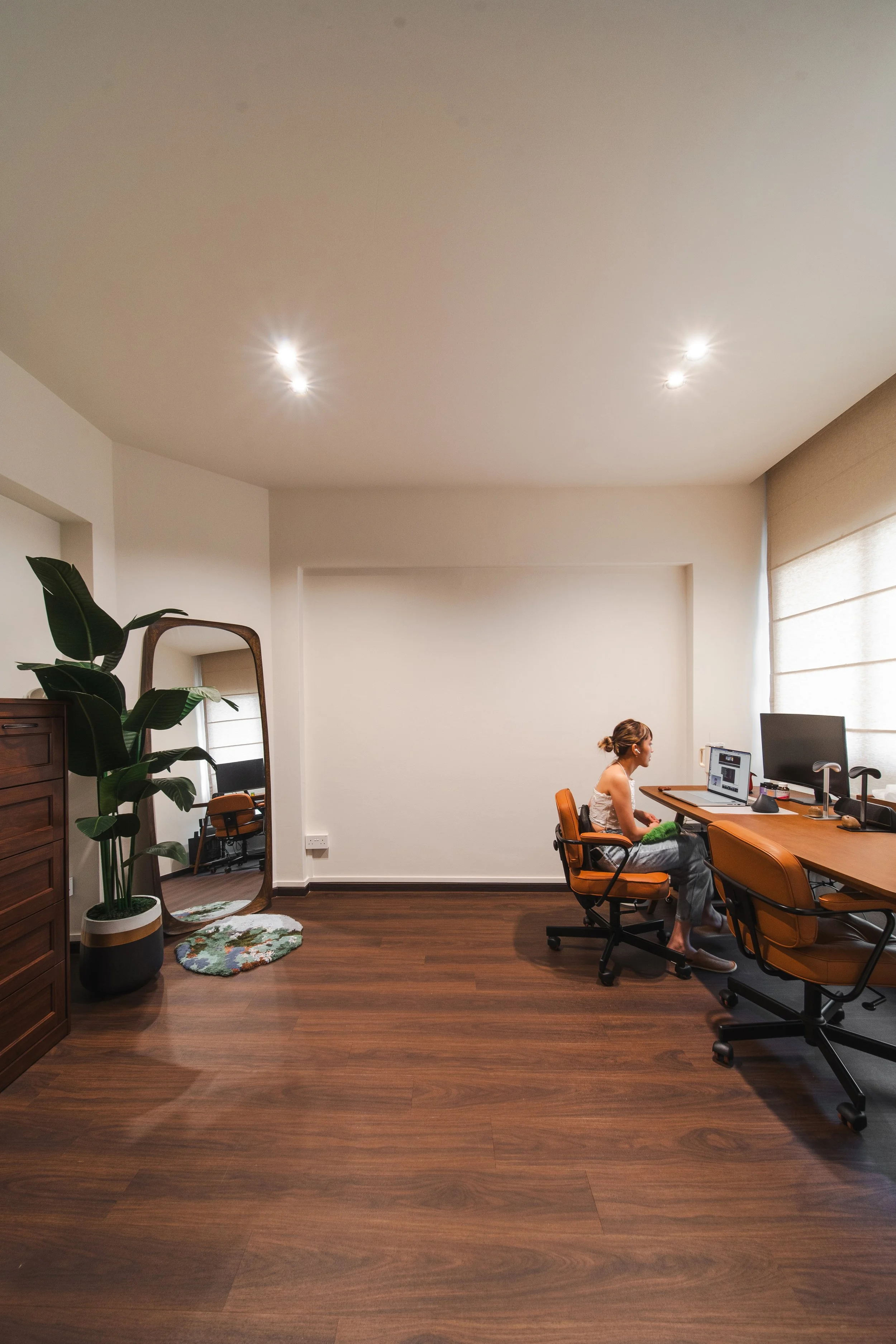
The original layout was reconfigured by combining the master bedroom and bedroom 2. Instead of placing the bed in the larger room, we intentionally shifted it into the smaller one—creating a cosy cocoon purely for rest. His-and-hers wardrobes frame the entry to the sleeping quarters, establishing a subtle symmetry while demarcating spaces. Curves in the false ceiling soften the edges, and a deep forest green envelopes the entire space—instantly grounding the room in calm.


The larger room became a multifunctional second living space with a dual desk workstation. Whether working from home or gaming together, this setup reflects how the couple actually lives.


Sliding pocket doors amplify flow and clarity throughout the private quarters. One slides behind a wardrobe to access the bedroom, while another disappears into a tall cabinet near the shower. These clean transitions make the rooms feel continuous, yet comfortably separated.
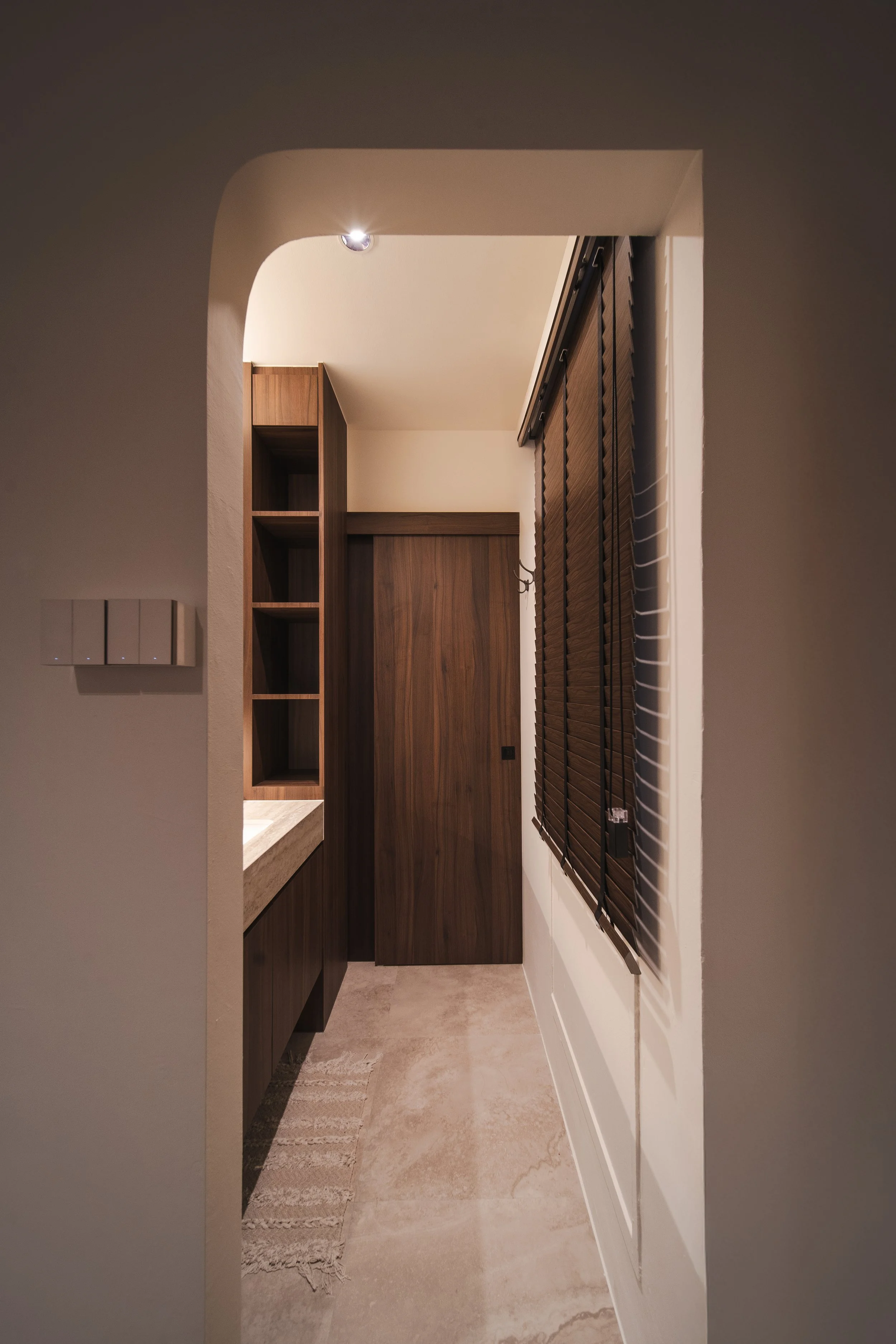
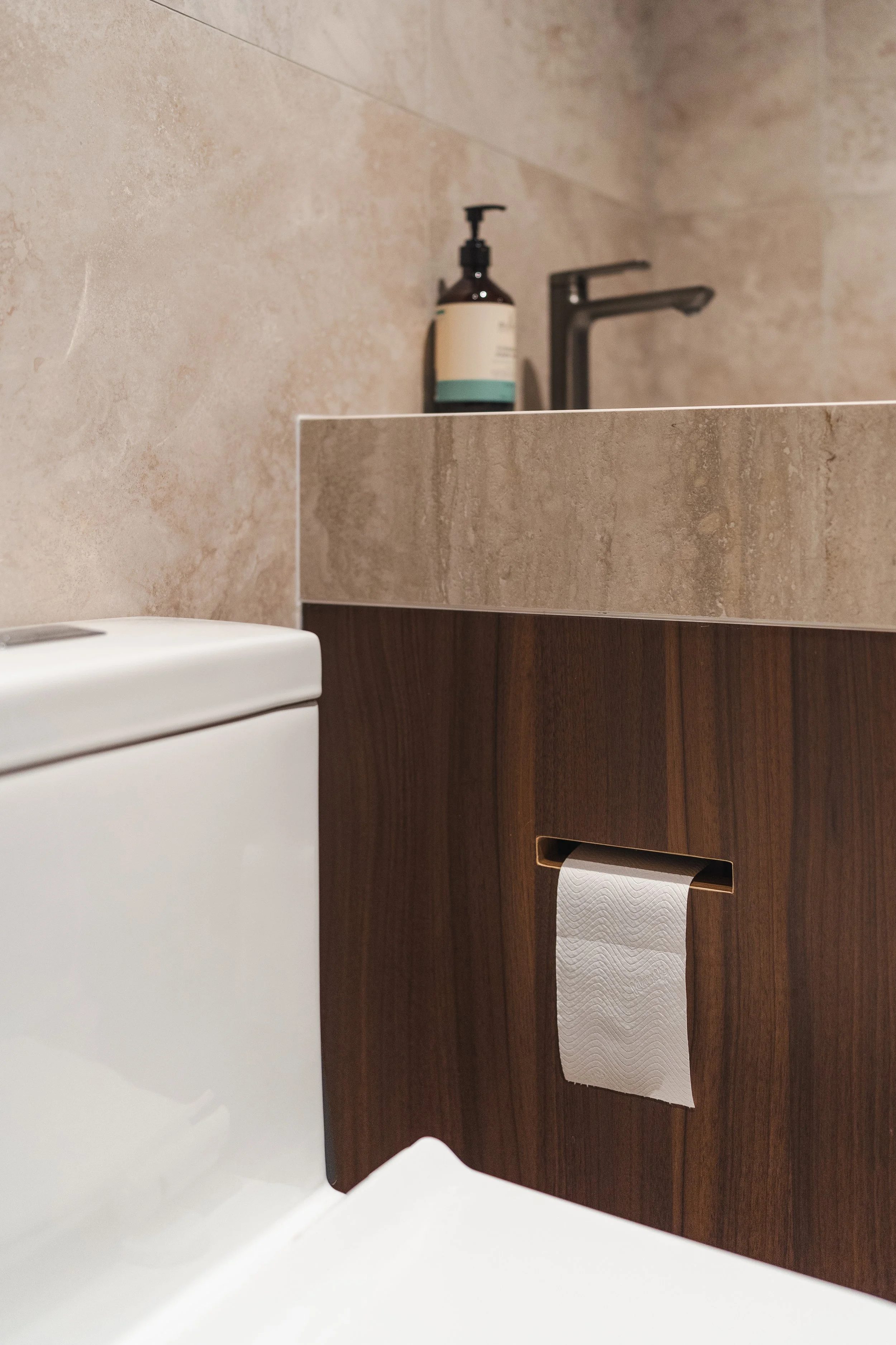

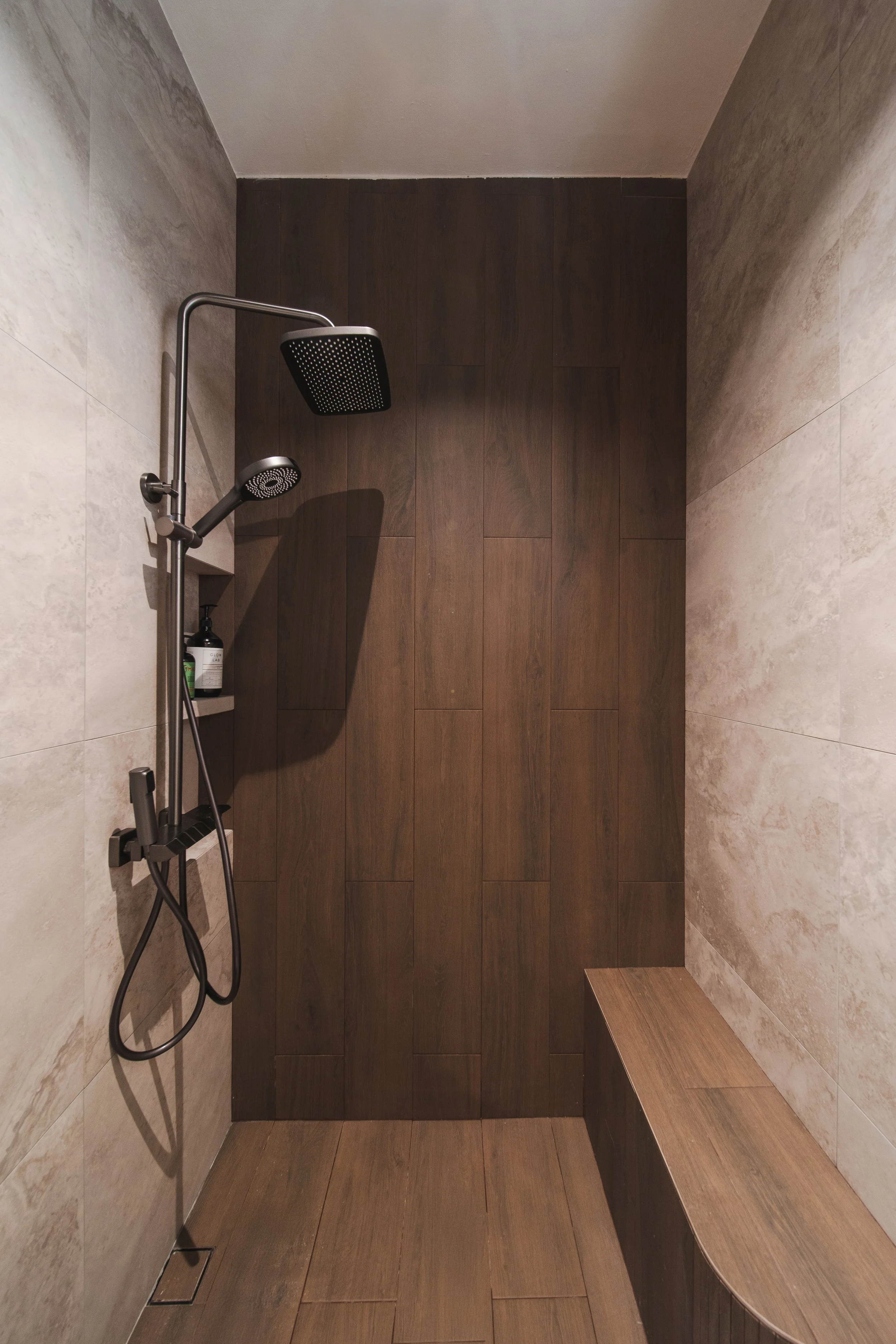
The ensuite bathroom echoes the home’s wet-dry principle. The vanity—extended for ample countertop space—sits apart from the shower, allowing both partners to use the room without getting in each other’s way. The details matter too: a concealed toilet roll holder, tucked into the cabinetry, keeps things tidy without sacrificing convenience.
Watch Marcus & Chesa walk us through their home on YouTube.
At its core, this is a home for a couple beginning life together. Every corner was designed not just to look good, but to feel right—to echo their energy, their playfulness, their warmth. It’s a home that grows with them. These are the kinds of spaces we love to design—ones that reflect the heartbeat of the people who live in them. Personal, intentional, and full of soul.
If you’re inspired to transform your space, connect with our designers here —we’d love to bring your vision to life.

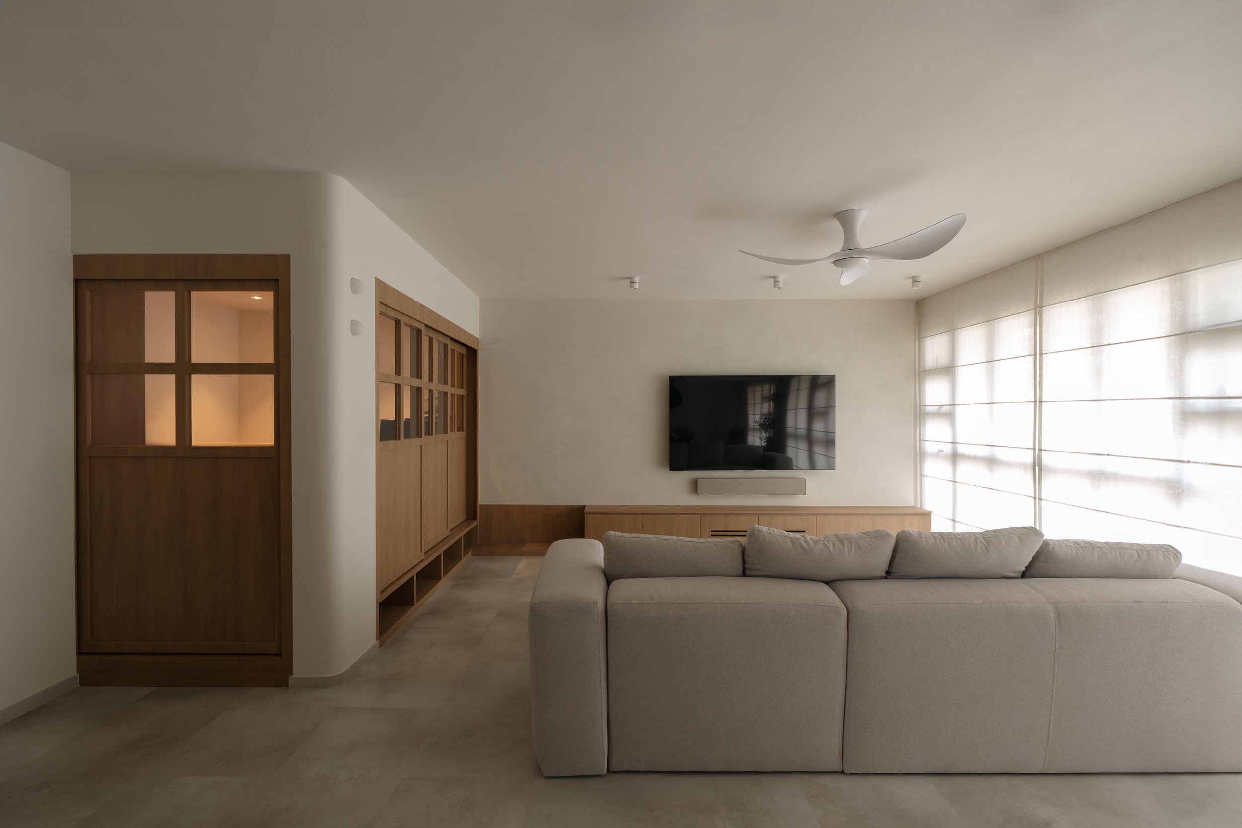
A Home That Brings People Together
This home is all about bringing people together, a space that feels open, warm, and effortlessly stylish — perfect for hosting, relaxing, or just enjoying a quiet morning coffee. Right at the heart of it all is the kitchen, designed to blend seamlessly with the dining and living areas.
952B Tampines
This home is all about bringing people together, a space that feels open, warm, and effortlessly stylish — perfect for hosting, relaxing, or just enjoying a quiet morning coffee. Right at the heart of it all is the kitchen, designed to blend seamlessly with the dining and living areas.


Turning a Challenge into a Feature
While it could have been seen as an obstruction, the large structural pillar at the centre of the home became a focal design feature. The island seamlessly wraps around it, integrating it into the space that doubles with the functionality of built-in storage on both sides. The cosy breakfast nook invites casual meals and conversation: whether you're cooking up a feast or sharing drinks with friends, this kitchen is designed to be both stylish and practical.

The family of three wanted an open living concept to host friends and family, so the space was designed to seamlessly integrate the living and dining areas, creating a sense of openness and spaciousness.


The foyer was designed to create a welcoming first impression while maintaining practicality. A subtle divider offers privacy from the main living space, ensuring a sense of separation without closing off the area. A sleek, built-in settee provides a comfortable spot to put on shoes, while additional storage solutions keep clutter at bay. The combination of warm wood tones and soft lighting makes this entryway both functional and inviting, setting the tone for the rest of the home.


An important design element we wanted to incorporate into the space was the use of black as a dark contrast to lighter wood tones and neutral elements. The clients wanted the home to feel cosy, but not too gentle. Hence, we incorporated some black accents to add contrast to the space. We decided to wrap the BTO doors in a black wood laminate as it brings in a certain masculinity into the home. Even the bathrooms follow this theme, with frosted fluted glass doors that let in light while keeping things private.


The entire home is designed with connection in mind. The kitchen island leads right into the dining area, which then flows into the living room—each space distinct, but all working together. In the end, it’s about creating a home that feels inviting, flexible, and just right for everyday life. Because at the end of the day, home is where you can kick back, unwind, and enjoy the simple moments with the people who matter most.

If you’re inspired to transform your space, connect with our designers here —we’d love to bring your vision to life.

Inside a Serene High-Rise Home
Amidst the energy of the bustling city lies a home for a young family of four. With large windows that invite streams of natural light, illuminating soft, minimalist interiors and framing stunning city views. Here, life unfolds with a quiet elegance, where every corner reflects the beauty of simplicity.
d'Leedon, Leedon Heights
Amidst the energy of the bustling city lies a home for a young family of four. With large windows that invite streams of natural light, illuminating soft, minimalist interiors and framing stunning city views. Here, life unfolds with a quiet elegance, where every corner reflects the beauty of simplicity.

Space Planning & Transformation
This home’s transformation began with reimagining a typical condominium layout plagued by awkward angles and odd corners.
Using three-dimensional software, the designer was able to map out solutions, showcasing how the walls could be adjusted to create a smoother flow. With the right space planning, the final design would feel cohesive and intentional, bringing the vision of a cosy and modern home to life.
The new layout creates a cohesive space designed around the family's lifestyle by reconfiguring walls and streamlining the flow of the space.


Final Product
The once-awkward layout has transformed into a seamless grey oasis, illuminating soft, neutral tones and unifying every corner with a sense of calm. What was once disjointed now feels perfectly aligned, creating a home where harmony and simplicity reign.
The ceiling's clean, timeless design, coated in soft grey limewash paint, adds a subtle texture that enhances the room’s minimal aesthetic. Its seamless flow and elegance bring a sense of calm, making it a quiet yet integral feature of the space.


The children’s room features a soft cream limewash, adding warmth and subtle texture. The final touches of furnishings complete the space with elements capturing the children’s personalities.

We are proud to have crafted a space for this family to host loved ones and create new memories.


If you’re inspired to transform your space, connect with our designers here —we’d love to bring your vision to life.

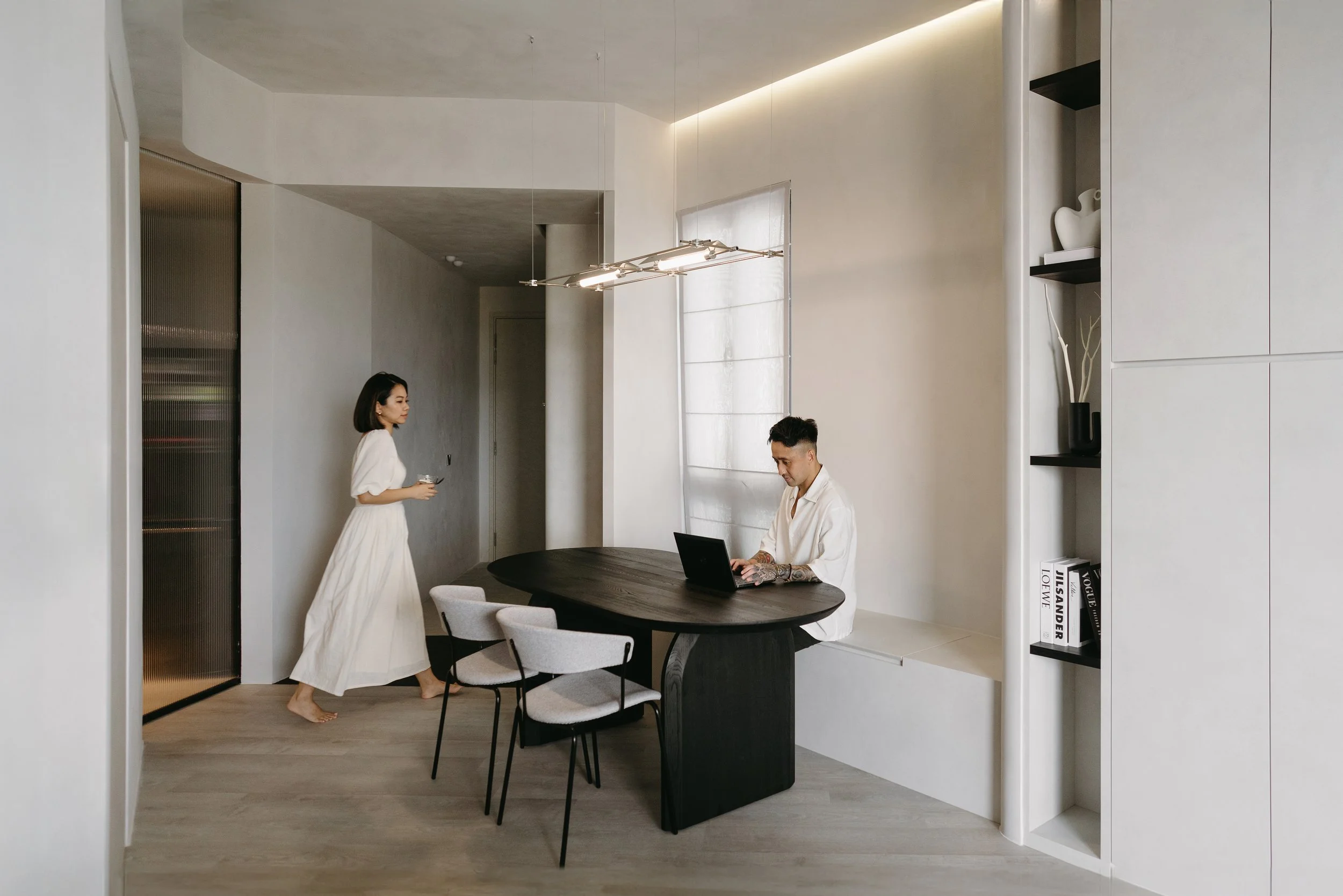
Designing a Space That Feels Like Home
The excitement and anticipation of purchasing a first home for a young couple in Singapore often start with the BTO. Each corner of the potential new space holds the promise of future memories — dinner parties, cosy nights in, and a growing sense of belonging.
663B Tampines St 64
The excitement and anticipation of purchasing a first home for a young couple in Singapore often start with the BTO. Each corner of the potential new space holds the promise of future memories — dinner parties, cosy nights in, and a growing sense of belonging.


Vision to Reality
The vision of transforming a house into a home starts by understanding the couple’s personalities and aspirations in order to reimagine a space that fits their needs. This journey is not just about updating a space; it’s an opportunity to imprint their personalities and aspirations onto a blank canvas. The journey begins with a spark of inspiration — a vision of how the couple wants their home to look and feel.

For a young couple that likes to host, an important requirement was to make the communal living space feel as spacious as possible, by knocking down bedroom 3 for an extended living and dining area.


They also liked having a designated foyer area to come home to, as a ritual practice of letting go of the work day as they step into the house. The foyer was designed to feel like more than just an entryway; it’s a comforting threshold, a space that marks the beginning of a personal retreat.


A separate study was also carved out in front of the bomb shelter to provide privacy, whilst still creating a space that feels connected to the rest of the room.


The house, once a blank slate, is now a reflection of our shared vision and efforts. The transformation from house to home is as much a symbol of our journey together and the future we’d love to help you build.

Connect with our designers here to arrange a meeting.

The Making of Our Studio Space
Located in a heritage building, our studio is more than just a space where we host meetings. Sneak a peek into how the space looked pre-renovation and the behind-the-scenes of the cosy space it is today.
801 Geylang Road
Nestled within a heritage building, our studio is more than just a workspace — it's a reflection of our passion for designing unique spaces. Whilst the space may not be large, we wanted to create a space that not only inspires us but also makes people feel at home.

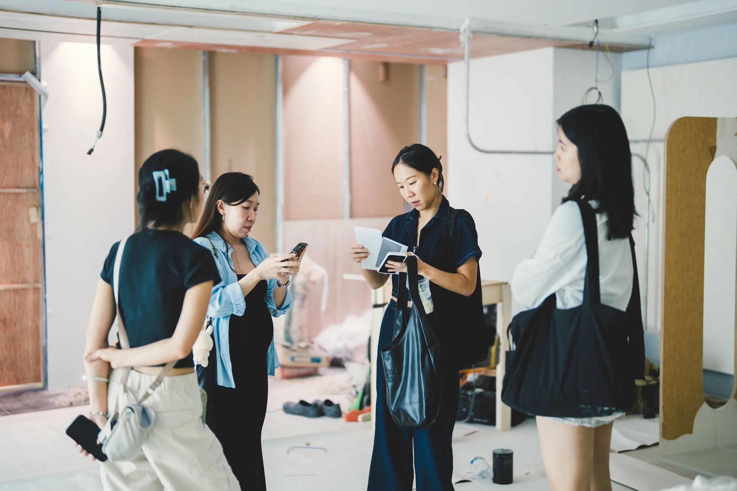
Pre-Renovation
We saw the potential in transforming what was once a traditional office setting into a cosy, charming space that reflects our aesthetic and values. By removing the carpets, exposing the beautiful wooden floors, and opening up the layout, we breathed new life into the space, making it a true reflection of our aesthetic and values.

Every corner of our studio was meticulously planned to balance functionality with aesthetics. The layout encourages collaboration, with open areas for brainstorming sessions and cozy nooks for individual work. The large windows invite natural light, creating a warm and inviting atmosphere that energizes us throughout the day.
Our Studio Today
Preserving the heritage aspect of the studio was a key priority while designing the space. Our design approach was to honour the building's heritage while incorporating modern elements. The juxtaposition of contemporary furniture against the backdrop of historic architecture creates a harmonious blend that is both captivating and unique.


The centrepiece of our studio is the communal table, where we gather for meetings, meet our clients and celebrate successes. Surrounded by lush plants and adorned with art that inspires us, this space is where creativity flows freely, and every project begins.


Every piece in the studio, from the furnishings to the lighting to the furniture, have been carefully curated to add both character and functionality to the space.

Have you been to our studio? Connect with our designers here to arrange a meeting.